

Nest
There are some magazines that have achieved an almost legendary status, proto-indies if you like. I featured some in a series for the ZEITmagazin instagram late last year – Speak, List, Kasino A4, Re- and Nest. All have been featured here on the Journal in some way over the years with the exception of Nest (the Speak post disappeared in a hacking incident… to be returned to). We felt it was time to set that right.
26 issues of Nest were published at the turn of the century, 1997–2004, by magazine newcomer Joseph Holtzman. Although positioned as an interiors magazine, it had a unique and influential approach, ignoring the usual upscale apartments and villas in favour of the strange and surprising. It sought unique visual stories, not selling product, and in this respect was a notable precursor of more recent indie magazines.

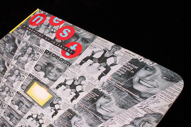
The physical nature of the magazine was as exciting as the content. The launch issue was relatively restrained, with a die-cut curved top corner (above) – this was just a hint of future issues. The cover image also set the tone for the project: a shot of Raymond Donahue’s attic walls and ceiling papered in B&W copies of magazine covers featuring Farrah Fawcett Majors. This was the type of curious story the magazine continually uncovered.

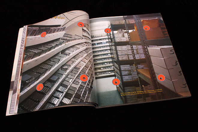
Others included a man who lived and worked in the same 18x30 foot ‘cell’ space; a series of Eadweard Muybridge-like images of men pissing (‘stream dispersion,’ above) and people getting in and out of the bath; a photographic exploration of life in an igloo. It was hugely inventive, and looking through issues now remains as inspirational as it did at the time.


That first curved corner developed into more flamboyant adornments: issue two had the same corner cut but also had a tactile fabric addition printed on the front, based on a wallpaper design by artist Rosemarie Trockel. By issue five (above), the outside edges featured a wave edge (along with Private Eye-like speech bubbles jokey referring to Architectural Digest and Wallpaper*).


Number six (above) was the first of a series where small holes were drilled through the entire issue (inclduing the ads), their position syncing neatly with the design grid inside. My favourite example remains the penultimate issue, where the top edges was cut to mimic an inset mountain skyline image on the cover (below). These remain a unique set of physical interventions on a magazine.

The page layout was special too, completely unlike the cool minimalism of so many interiors magazines before and since – Nest was not a magazine of white space. Just about every inch of paper was covered in ink (below), made up of bleed images and colour patterns. Close-ups of wallpaper designs and fabric patterns were regularly used as backgrounds to images and headlines set in decorative typefaces rather than a considered palette of fonts. It was chaotic, but this maximalist design perfectly matched the print effects and die cuts, not to mention the extraordinary stories being told.


Nest remains a unique publication, much noted at the time and fondly remembered (and collected – copies regularly appear on eBay). Stories about its demise revolve around Holtzman working through his family inheritance to produce the magazine, although he’s quoted at the time as becoming bored with the project and wanting to move on.
I also found a lovely quote from an interview by Steven Heller that’s newly relevant, ‘I like to show the Great Houses, but in a different way. It’s interesting to a young reader to understand that these places were in bad taste, sort of Donald Trump, when they were first built.’
Apparently Holtzman retired to upstate New York, but if anyone has news of him I’d love to hear it.
http://magculture.com/re-magazine-8-2002/
http://magculture.com/list-magazine/
http://magculture.com/kasinoa4/