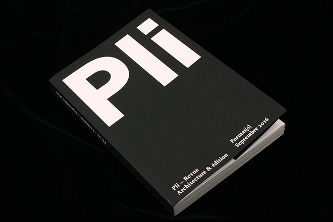
Pli #2
Architecture and publishing have enjoyed a long relationship, perhaps because the theory, discussion and advance of architecture can be more quickly accommodated in print than in the form of a real life building. The 2011 book (and exhibition) Click Stamp Fold provided historical context for the form, and showed that many such mags are small, zine-like publications. Local favourite Real Review is just one recent example in that vein. But new French title Pli is a bilingual, heftier publication, and expressly links the worlds of architecture and publishing.
The editor’s letter asks several questions, with ‘How to bring graphic designers, publishers and architects to work together?’ being the central one. We’ve selected Pli as our Magazine of the Week because it does exactly that very successfully. It looks fantastic, using a strong, structural approach that speaks of its subject while being highly readable. The two languages are simply split, generally leading with French since that’s its country of origin. The lead language uses a satisfyingly large type size, and the translation is significantly smaller across two narrower columns; this simple shift provides just enough pace through the pages.
The design structure is emphasised by using only black ink; the first issue was far more colourful but for this one, themed ‘Formats,’ the team have stripped it down to black and white. The simple format of the design shines through in monochrome from the cover on.
This is emphasised by a brief colour section about book formats, and the generous insertion of extra full-colour elements: fold-out posters, illustrations and cards are slotted thoughout, separate items that jump at you colourfully. Each one is inserted at a precise point, alongside a page carrying a description of the object (size and format) and subject. It’s a clever way to position the black and white main part as purposefully colourless.
Some of the content concerns subjects familiar from other contemporary architectural reviews: urban sprawl, the rebirth of Detroit, the divided city of Paris. But alongside these are essays linked more closely to publishing; the key essay for me is Giaime Meloni’s reflection on form versus content, which opens with the wonderful quotation from poet Stéphane Mallarmé, ‘Everything in the world exists in order to end up as a book.’
Pli is a beautiful piece of print that’s been well-conceived to reflect its subject and theme for this second issue. I’m intrigued to see how they’ll adapt it for issue three, Conflict.
Editors: Christopher Dessus, Marion Claret, Adrien Rapin, Margeaux Desombre and Thomas Lapointe
Design: Jean-Baptiste Parré


