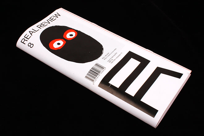
Real Review #8
Now eight issues into its run, Real Review has established itself as a must-have for anyone interested in examining the way we live today. Lauded for the depth of its writing and its unique folded format, we’ve always been intrigued by the painterly faces that have become a vital part of its visual identity. Founder Jack Self talked us through their evolution.
‘The faces represent the current mood of each issue, and I design them with creative director Rory McGrath and illustrator Nishant Choksi,’ Jack told us, going on to explain how the review started as a subscription-only publication, ‘This was partly sales pragmatics, but it was also an attempt to create an environment where the cover would be liberated from the need to seduce people to buy the magazine. I didn’t want to compete with other magazines.’
Initial cover designs by McGrath and his studio OK-RM featured a prominent image. ‘With the large R it all looked extremely stark. We asked Nishant Choksi to join the project because his brushwork and free hand establishes a tension against the geometry of the R.’
That tension is key to the identity of the magazine. The monochrome typography of the large R and the magazine name is rigorously consistent, while the face adapts itself to the mood of the issue.
I asked Jack to talk us through the eight moods to date:
1. Many as one
(the open mouth revealing many voices, after Hobbes' Leviathan frontispiece)
2. Historical deja vu
(a Janus-like face looking back and looking forward)
3. Global civil war
(many eyes not sure which way to look)
4. Love today
(Sisyphus and his reflection)
5. Systemic doubt
(a doubtful face who in turn is being doubted by another behind it)
6. Just in time
(the face didn't quite make it into the frame)
7. Woke awakening
(a Cyclops who is very awake)
8. Against from within
(a balaclava)
Buy your copy from the magCulture Shop:


