Alexander Tochilovsky, typographer, teacher, curator
This week we asked Alexander Tochilovsky, graphic designer, typographer, teacher, and Curator of the Herb Lubalin Study Center of Design and Typography in New York, to select his favourite magazines. Alexander is currently programming the ‘Typographics 2016’ conference, and he spends most of his day in the Herb Lubalin archive surrounded by stacks of magazines. We asked him to choose three issues from the archive: an old one, a new one, and a detail that’s especially interesting.
“I am a big fan of older magazines, especially from the sixties, and am fortunate to have a dream job which allows me daily contact with some of the most memorable magazines ever made. As such my home collection is quite modest, it’s mostly books, since I have relocated all my magazines into the archive. That way I have frequent access to them, plus they are useful to the visitors to the archive as well as to my students.
“The archive has many titles that I go back to time and time again. There are issues of Brodovitch’s Portfolio, Lubalin’s Eros and Avant Garde, Gertner’s Capital, Vignelli’s Dot Zero, Lois’ Esquire, Kalman’s Interview, and too many others to name. Here are some of my favorites.”
Old Issue: Show Magazine, 1961
I really had a hard time picking between this one and an issue of Nest magazine, but the content of this one clinched it for me. So my choice for the “Old Issue” is, Show Magazine’s December of 1961 issue. The cover of this magazine is perhaps not the most memorable, but the interior more than makes up for it.

Henry Wolf brilliantly art directed this magazine for three short years. He created what should easily be considered the American equivalent of Twen—albeit it is relatively unknown today. Wolf, the Brodovitch protegee, found a great opportunity at this brand new magazine, with seemingly a wide range of creative freedom. His design is restrained, but incredibly delicate, thoughtful and innovative. For something that came out in the beginning of the 60s it feels incredibly contemporary, especially in its use of photography. I love so many of its details.


The transition from the front of the book—with the header twisting its way across the top towards the short edge, and jumping onto the opening of the well—is playful and smart. I love the way the opening of the well is signalled by a completely abstracted, blurry photo. This then comes into sharp, almost stark focus on the following spread. It’s really mind-blowing. And that page then transitions seamlessly onto the next spread. What a great sense of pacing. It is just so good.


This issue as a whole has stunning features, especially the fantastic article by Gay Talese on the old, (and appropriately seedy for that time), 42nd Street, illustrated by the wonderful, (and very rarely seen), photos by Robert Frank. It’s an issue that never disappoints every time I look at it, or show it to others.

New Issue: Human Being
There are lots of new magazines out there these days, and I am glad to see so much energy in publishing, especially from small upstarts who are challenging the existing norms of big publishers. Much in the same way Show magazine carved a niche for itself, I see a lot of new vibrant magazines.


I am currently reading a couple of issues that came my way from Richmond, Virginia: Issues five and seven of Human Being magazine. I am a sucker for small format magazines, (this one is only 6.5 x 8.5 in.) because I like the challenge it presents for the designers. I appreciate well-resolved small formats. This is one I like a lot. The design might feel like it’s of its time, but it feels considered and convincing. There is a sense of earnestness about it. The articles are well crafted. The writing is good. The art direction of the fashion pieces is interesting, and different without being too trendy, or too esoteric. The typography feels right to me, with a nice level of fussiness which I appreciate. It’s also nice to recognize people who are covered in the magazine. They all feel like real people.

And another thing: Flair Magazine, Jan. 1951
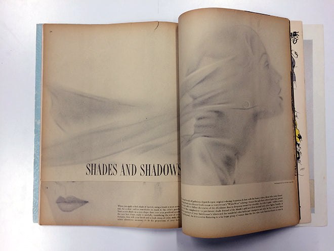
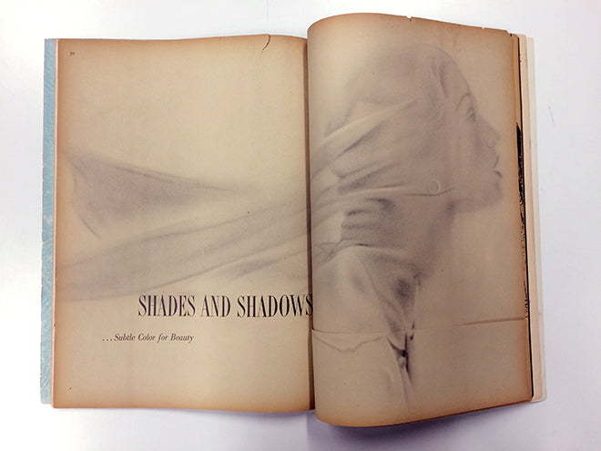
Lots of things to pick for this, but I decided to settle on one of the most memorable moments in a magazine I’ve ever encountered. It comes from the last issue of Flair Magazine, from January 1951.

The issue has a few amazing details, but this one takes the cake. The detail in question is a single spread of a beauty feature, called “Shades and Shadows”. The feature takes up exactly one solitary spread, consisting of a full bleed image across the spread and a headline with a subheading. That’s all. But, the ingenious part is that the text of the actual article lives at the bottom of the page, and is achieved—concealed if you will— by the use of a die cut to overlap and superimpose the bottom ¼ of the page. This leaves the expansive and airy feel the image at the top of the spread creates. It is so simple but so stunningly effective.


