

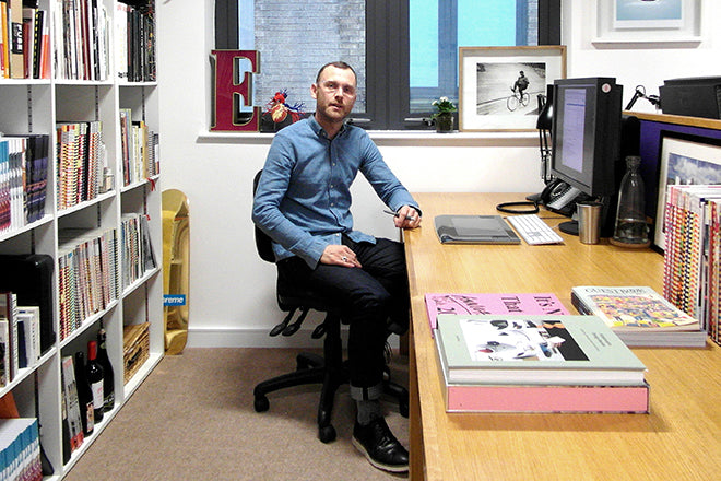
Andrew Diprose on Wired at 10
Happy 10th birthday Wired UK! We asked Andrew Diprose, its art director since launch, and latterly group creative director, to offer his perspective on those ten years and select his favourite five front covers. Andrew has previously worked for titles including GQ, Elle, Esquire, Arena, i-D and Smash Hits as well as co-founding early indie favourite The Ride Journal.
How has the magazine changed over the ten years?
The main change? We have lots of different channels now.
When we started it was all about print, then it was about the print and the website, then the print, web and the digital (iPad) edition. Eventually we paused on the digital edition, it just wasn’t financially viable at that time – the model was imported from the US where the resources and audience are quite different.
Now Wired has a folio of different revenue streams and ways that people can access the brand that didn’t exist ten years ago, like Wired Consulting, or Wired Events. I constantly have to remind myself that the way that I may view content isn’t the same way that another reader might come across it on social media or at an event, and that there are many ways to interact with the Wired brand.
Wired led the rush to make an iPad app, which is no longer published. How do you look back at that now?
Personally I miss it as a product because it gave us an opportunity to do something ambitious and different to print, which though it has its own virtues, has obvious limitations. The digital magazine gave us the opportunity to do something beautiful: we’d have scrolling text and drop caps that would butt pixel-perfect to images, we could do really clever layouts with moving image and animation.
People often comment on our use of ink in print and that we’re always using fluorescent or metallic Pantone colours – but if you’re working in RGB everything has potential to have that palette! It just gave me another opportunity to play with colour.
It would have been great to have some of that custom coding from the digital edition come over to the website, I’m aware we’re limited to what we can do with the CMS right now. Interestingly some of what we were doing with the digital edition back then is what a lot of people are trying to do with web now. For example Wired is now building a substantial audience on Apple News. We’re experimenting with what’s possible on there in terms of custom coding: how can we make a more immersive experience for our customers on there? Similar intention on a different platform.
Is it tempting to try to be a tech trailblazer or is it better to stick to what works?
We’re just enthusiastic about telling stories however people come to them: there are so many different ways that people are finding out about our content on different platforms now, we have to make a decision about which ones we have the resources to do properly. How much do we do with video, for example. When you have a modest team size and you have to be financially viable and make clever business decisions, that actually dictates where you end up.
We still love making a print magazine though – it’s a great ‘flagship store’ for us, and still works really well with the other sides of the business.
‘Wired sits in that happy medium where you have the resources and remit to do something really ambitious with your ideas even if you still have to fit in with certain constraints!’
A few years ago we didn’t think that people would want to sit and read four thousand words on their phone, but these days they do, that longform journalism that used to just be ‘print’ stories is so successful for us online.
Ten years isn’t really that long but everything has changed in that time. In any week I might be working on the cover, or overseeing the development of a film, or looking at branding for an event, or AR experience for a partner. Wired is one of those unique titles where you have high creative possibilities and expectations within a traditional publishing space.
Where can you see the magazine going in the next ten years?
The only thing (and this is as true for Wired as well as other publishers) is that we have integrity and quality – whatever platforms come and go. My remit is to make sure that the visual quality is there, and the integrity of those stories shines through. That’s it.
Magazines are a great place for the people who are passionate about storytelling and commissioning the finest art, no matter if it’s print or online or a hybrid of everything. I think if you’ve got people at the helm with that passion it doesn’t matter where you end up, as long as people want to read those stories.
How does a cover come to exist?
The cover story will come from the editor, and they will entrust myself and the team with giving it a visual form in-keeping with the Wired brand: which will sell copies while still treating the story with respect. Quite often a Wired cover star isn’t necessarily a recognisable person, who might not be that interested in being photographed, so we have to work around that. At the same time we’ve had to make intangible things visible and approachable – especially when the subject matter is difficult to understand, that cerebral stuff!
Wired really stands out amongst the other Condé Nast titles as looking quite indie and unusual, however at the same time if you put it alongside indie titles it looks much more commercial. It sits in that happy medium where you have the resources and remit to do something really ambitious with your ideas even if you still have to fit in with certain constraints!
Andrew’s pick of the Wired front covers, 2009—2019

The Great Trust Experiment, June 2010
Typography: Matt Willey / Studio 8
This was a fun one. Often our palette is pretty bright, in order to stand out on UK newsstands, and yellow does really well for us. We combined this colour-scheme with some brilliant typography from Matt Willey who was at Studio 8 (he is now art director at NYTimes Magazine), which was an unusual one for me because we often do all our typography in-house, but it really paid off and I loved what he did.
For me it’s an example of a classic Wired concept, where we had this idea of the latex scratch-off ink to play on the idea of trust: We printed ‘do not remove’ and covered up these extra bits of the cover lines as a little bit of a trust experiment on the cover, and it worked so well for us! People started sharing images of it on Twitter, teasing each other about it, so it was a lovely moment where print and social media organically came together and people shared their scratched-off covers.

Fail!, May 2011
Photography: Peter Beavis
This always makes me laugh; the editor said ‘the next cover is Alan Sugar, and it’s all about failure’! Alan didn’t want to be photographed particularly – I thought he might be back in touch to say that he disapproved of what we’d done but it seemed to go down well with everybody (we got an SPD merit for it in a tough category).
I wanted to do something fun with the idea of failure, which at the time wasn’t the big business learning that it is now. I would have loved to do it without the extra logo at the top: but it really illustrates the fact that every cover I do has to be signed off by management at Condé Nast and that’s just the way it is. It still has to read top to bottom – it appears really messed up with the analogue printing ‘fail’ but if it hadn’t read on newsstands at first glance it wouldn’t have gone past the editor.

Bjork, August 2011
Photography: Ines & Vinoodh
This cover was in time for the release of ‘Biophilia’ and the ground-breaking app that was launched with the album. Wired is often about hybrids and this was the perfect marriage of music & technology a fantastic experiment in sound and visuals.
Of the selection of images that we worked on with Ines & Vinoodh (an awesome photographic duo that came part and parcel of working with her) this is the most commercial by far, but she still has this crazy ring of red crystals with a blue, high contrast face which for us at the time was really pushing it when the rest of our covers were a little bit more, er, traditional – now I look back on it quite fondly as a really fun cover, but at the time it gave myself and the photography director Steve Peck ridiculous amounts of stress and angst!

Buy This or Be Hacked, May 2016
Illustration: Andrew Diprose, based on an original illustration by Denilson de Souza Medeiros
This is a perfect idea of a Wired cover where we wanted to get the sense of digital hacking and fear without falling into the trap of visual clichés of technology. I wanted to do something with a skull but not in a normal way – I found this illustrator from Brazil, who had done an illustration similar to this. In order to make it work I had to redraw it myself and integrate the cover lines, but while still acknowledging the original work. We wanted to represent hacking in a way that was serious but still visually arresting and appealing: most crucially it wasn’t miserable or relied heavily on ‘hacker’ clichés. It sold really well for us and was a different way around that problem.
We’re still trying to play around with how hard we can push the cover line to sell the story whilst still being true to the subject matter, so when people get inside it’s not a tabloid-y ‘click-bait’ oversell of the story. The line was a little bit publishing old school, something we don’t do too often, but every month we’re still playing around with how to work on a cover line: how simple can it be, how punchy can it be, are you going to understand what the story is in two or three seconds?

Black Mirror, May 2019, subscriber cover
Photography: Nick Wilson
This cover gave me a really good opportunity to do something for subscribers that’s a little bit different from the newsstand cover: you don’t really need any cover lines because you know exactly the story. The one on the newsstands will be have a few more lines, play it a little safer. It’s our tenth anniversary issue and it’s going to be a big deal for us: perfect subject matter in that it has that fusion of storytelling, culture and the future.
The treatment one was so simple and direct – I had a few tortured moments where I thought, “Do I really do black and a mirror? Yes, of course I do!” but I’m glad we interrogated that thought process. For a subscriber, Charlie Brooker is someone you’ll recognise immediately; and you don’t really need any cover lines because his image and the cracked mirror does all the storytelling for you. He was lovely to work with. The dystopian near-future technology that happens in Black Mirror episodes is stuff that’s already happening, he really is a future-forecaster as well as an entertainer.
Editor: Greg Williams