

Accent #1
The last time we featured Accent on the Journal, we celebrated how it translated a print experience into an online format. Today – almost one year later – we’re celebrating the exact opposite. The photography journal that documents ‘lives lived outside of the ordinary’ has produced its very first print edition after releasing quarterly online issues since 2013, and its transition from online to offline has been well worth the wait.


Accent has always has its own particular brand, voice and mood – the collection of stories and photos it brings together boldly capture distinct, lively subcultures and underground scenes from around the world. There’s nothing contrived about it, and the words that accompany photo stories have always felt honest and poignant. Accent in print is no different. Inside, DW Mellor captures the life of an elderly bachelor living in Philadelphia (above), Lukas Berger documents a circus in Pakistan (also above), Stella Malfilatre interviews to former punks about in London (below), and a story on HIV-positive multimedia artist Kia Labeija elegantly documents the history of voguing and drag in New York (also below).


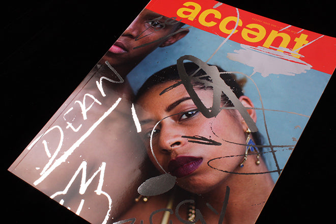
Online Accent always used a different hand-made typeface for each issue. For print, the editors have speckled the cover with shining, hand-drawn words, but inside, lettering is entirely computer generated. Although they haven’t continued with the hand-made type on the inside, they’ve purposefully chosen type that’s bursting with character for titles and headlines (below). Typography is very much a visual accent for them: it adorns and asserts the moods in a magazine filled with many voices.
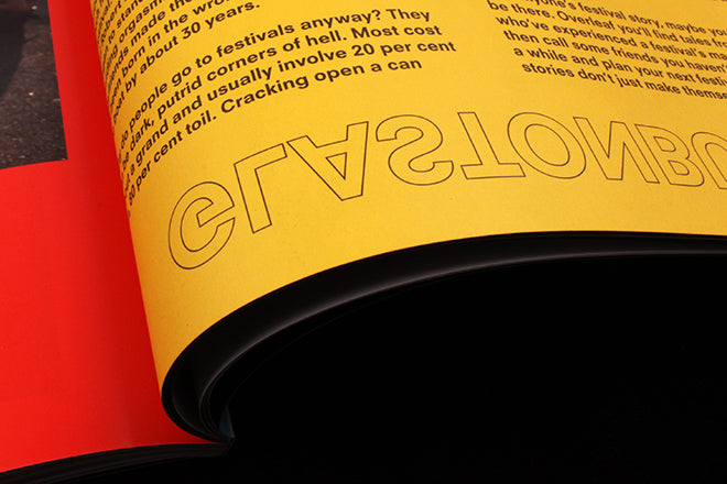


Layouts for photography magazines are usually minimal, which I always think lets the pictures do the talking. Accent is minimal in some ways but it’s also flirting with the mad – its design conveys a sense of self through vibrant use of typography, yet plenty of white space also gives photographs room to breathe. I particularly enjoy the detail with the page numbers, which are repeated along the margin three times (below). I don’t know if there’s a purpose behind this or if it’s simply a design flair, but it gives the magazine a distinct edge. Occasional bouts of matte, yellow paper stock and vibrant red also add to the energetic flavour of the publication.

In a recent interview with It’s Nice That, editors Lucy Nurnberg and Lydia Garnett contextualized their design decisions: ‘We’ve always loved 80s mags like The Face, i-D and Interview that are filled with energetic type and big smiles. We wanted to create something with that level of confidence.”
Printed Accent is loud and colourful and it’s arrived with a spectacular bang: with its glossy paper-stock, vibrant tones, warped type and excellent curatorial approach, it’s the latest must-have mag to come out of London, at home alongside the likes of Mushpit and Law.
After posting we got an email from Lucy with a bit more info about those fantastic page numbers: "they're a subtle reference to the designs on the back of medium format film as you're winding it through a camera."
Read our review of the Accent online magazine.
Editors: Lydia Garnett & Lucy Nurnberg
Art directors: Luke Tudor Griffiths & Charlotte-Maëva Perret