

Accent #2
We’ve selected Accent as our magazine of the week because of its engaging use of typography. I’m specifically talking about the way that it matches its unique photo stories with great splodges of expressive font.
I’ve talked about how brilliant the visual ‘accent’ of the London-based photography title is before – when it was a web-zine, each release had its own custom typeface that articulated the tone of that issue, and its first print edition earlier this year carried on with that tradition. Issue two continues with the concept of type-as-visual-accent: this attention to detail propels Accent out of conventional photography magazine territory and into something very special.


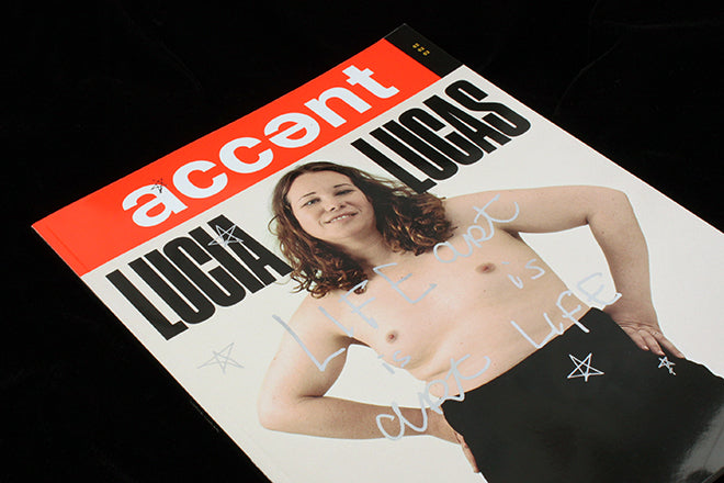
Accent is a photo-led celebration of ‘lives lived outside the ordinary’, as exemplified by the double cover stars Andrew Logan – founder of Alternative Miss World – and Lucia Lucas – a transgender opera star and one of the world’s only female baritones. For Logan’s interview, the artist himself has scrawled across the spreads to infuse the design with a sense of his personality (above). Lucia Lucas’ interview and shoot exudes power through blocky, engaging type and striking photography by Alice Neale (also above).


Amongst graphics and visual details that emphasise the personality of the profiled, Accent retains its sense of continuity and self through a colour motif and its particular trait of slicing through spreads with chunky blocks (above). The way that different emphatic type playfully engages with photography across a spread is an essential part of the brand (below).


Inside, you’ll also find a feature documenting the lives of contortionists, tightrope walkers and aerialists accompanied by text written by the photographer (below) and a selection of wartime photographs by Vietnam veterans with words taken from a poem (also below). Unlike many photo journals that we see on the shelves, Accent is word-heavy – relishing in the written word and its visual expression as type.


Paper choice (glossy, flimsy and welcoming), size (a little bigger than your ordinary fashion title – it seems to shout out from the shelf), and the genuinely unexpected and lively selection of stories makes Accent one of the most seductive photography titles around right now.
While there are many photography journals showcasing great work, Accent goes one step further in a way that could be paralleled with long-established Der Greif. These magazines don’t showcase like a photo book or gallery might; they use the magazine format to delve deeper and make new connections. Accent is interested in words as well as photos – it speaks volumes through its typographic treatments.