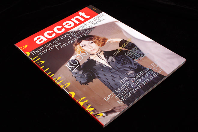
Accent #3
Some people say if a magazine clears the third issue milestone it will survive. Accent have not only flexed their raw individual style with their third issue but absolutely smashed through this target with brave new changes. Now all grown up, running a supper club and with three brilliant issues behind them, the tone of the effortlessly punk and inherently ‘woke’ mag is more relevant than ever.
As touched on by the Journal before, the wild abandon of their typography is drawn from first generation style mags like i-D, Blitz and The Face. Editors Lucy Nurnberg and Lydia Garnett have explained in interviews how they loved these 80s mags filled with energetic type and big smiles, ‘We wanted to create something with that level of confidence.’ Their latest cover star Kodo Nishimura, buddhist monk and make-up artist, exudes plenty of both, as does fierce Vogue dancer Alex Mugler, featured on the back cover (above) and randomly throughout the issue.
The magazine continues to team thorough written pieces with exciting photography. The soft and tender ‘How to be a Dad’ story sees black fathers commenting on race, politics and masculinity, opening with an imposing pregnant tummy alongside a full-page portrait (above).
Previous issues used a handwritten scrawl as a prominent visual feature. Here, they experiment with the entire page, artificially condensing serif type and laying slabs of colour to reinforce the chaotic character of their layouts. They’ve never shied away from daring colours and once again overload the reader with their trademark toxic yellow and dangerous red.
Originally a webzine but now firmly estbalished as a print title, an international catalogue of contributors have delivered a stunning body of work for this issue; the Accent girls have taken their magazine to another level. Like Brick, Cause & Effect and King Kong, a powerful mixture of photography and design mirrors the outrageous outside world.
Accent’s maverick style sets it head and shoulders above cleaner, tidier magazines, reflecting the weird and wonderful nature of the human condition. The issue is a purposeful step forward in confidence and will surely reach a wider audience. In the process they haven’t lost a drop of flavour.
Editors-in-chief: Lucy Nurnberg and Lydia Garnett
Art director: Luke Tudor Griffiths


