Alice Bowsher, Illustrator
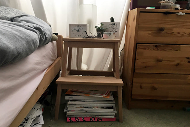
For this Friday’s instalment of Issues, we’ve browsed through the bedside magazine stack of illustrator Alice Bowsher, whose charming, joyful work has been featured in a number of independent publications including YCN Magazine and Fiera. She also drew the set of magCultural characters we use to promote our Shop. Nice!

We asked Alice to select three of her favourite magazines for us: a new one, an old one and a detail that she finds particularly excellent. Here’s what she chose.

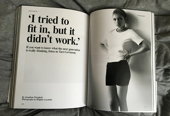
New Issue: System
Last year my sister had this issue of System and after going round for dinner and reading only half the Raf Simons interview I got jealous and had to go buy it for myself. System has the perfect ratio of image to great content. It’s packed with full bleed Juergen Teller photographs and interesting lengthy interviews rather than a bunch of small features you end up skipping through. I just wanted to take everything in.


Whenever I buy a magazine I tend to be drawn in by visuals over articles but System has got it down. I came for Raf Simons and stayed for literally everything else it gave me.

Old Issue: Vogue August 2006
The first time I saw Tim Walkers photographs were in Vogue, which I started buying in my early teens. At the time I was convinced I would go into a career in fashion and I mainly bought the magazine for the photo stories over the articles and shopping suggestions. Tim Walker’s adventurous stories always offered something a bit more magical than most others and left me amazed by his styling and dreamlike aesthetic. I think the fact that the images were paired with such crazy priced pieces and articles I couldn't fathom when I was 14 made them even more other-worldly.

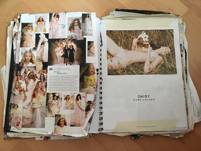
My dad convinced me to cut out all of the articles and photos that I liked the best so I didn't have thousands of magazines stacked and crammed all around my room.


I am still unsure whether is was a good idea or not but I now have all of my favourite pages from old issues of Dazed & Confused, Nylon, Vogue, the odd Telegraph Magazine and Sunday Times supplement in a ‘scrap book’. Unfortunately I don’t have the whole copy but this was one of the photos from a story I vividly remember from the August 2006 issue.

And another thing: Infographics in Elle Collections
The way Elle Collections display their infographics has always appealed to me. They manage to present a full collection, with fine details from the shows showcased in a lively way. Rather than giving the information with a view of telling you what’s cool to wear or not, you just got given everything - you make your own mind up. It was much more of a scrap-book than a polished mag.


Despite being made by a very mainstream Elle, it was always full of extras such as supplements, different paper stocks or stickers, and it didn't feel like it was taking itself too seriously. As a result it’s more personal, more creative and less elite than the higher end fashion magazines. They remind me of my own magazine scrapbook, perhaps that’s why I was drawn to it so much.


