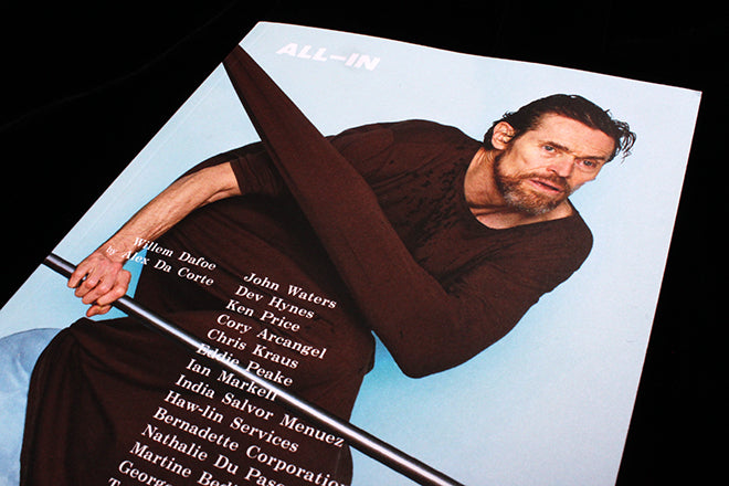
All-in #1
Willem Dafoe precariously balancing on a chair is an abstract way to begin a magazine, yet this is what sets the tone for new art and design All-In from New York. The publication’s name and concept are also abstract, but intriguingly so: it sets out to document ‘the grey areas’, the things that lie between dichotomies like ‘past vs. present, virtual vs. real, old vs. young, life vs. art’, and it does so by interviewing various image makers and artists.
 There are a lot of contemporary favourites from various fields featured throughout the booklet-sized mag: there’s a piece on Nathalie Pasquier, a definite favourite of independent design publications at the moment. For the title spread, All-In have gone less pattern crazy and more minimal than what I usually see for Pasquier interviews, with a neon yellow background and simple speckle of ornament (above). Title pages throughout the magazine always use enlarged text – the kind of size usually associated with a headline – so these spreads jump out in a unique way. I also like the scratchy illustration by painter Alice Lancaster that accompanies the page introducing John Waters (below).

 The interviewees are wide in scope: as well a design extraordinaire and great actor, an interview with theorist and writer Chris Kraus changes the pace significantly, and a feature on the sculptures of Eddie Peake suits the minimal, shadowy and tumbling aesthetic of All-In (above).
 A spread of work by Berlin-based creative agency Haw-lin Services ticks off another contemporary design favourite (above), and the shoot of Dafoe by Alex Da Corte, where each picture alludes to a famous portrait painting, is a whimsical highlight (below).

 All-in really is ‘all in’ in terms of covering all grounds. Even cooking comes into play: at the back there’s a series of receipts for things like ‘Octopus flowers’, ‘Panna cotta with some lemon curd and Funfetti’ and ‘Cigarette’, and you can cut these out and put on your fridge (above). The publication is a strong example of the increasingly popular genre of interdisciplinary art/ interview magazine – it features a great scope of thinkers and makers, and it’ll be interesting to see how it develops with an issue two.
Editors in chief: Benjamin Barron and Allison Littrell
Design: Hudson Shively and D Elif Tanman


