Andròmina #1
 Every object tells a story. And many stories are now told through objects – it’s a zeitgeist that’s been prevalent since artists like Gordon Matta-Clark championed the stories contained in items of garbage. This narrative device is one we now see a lot, made popular by recent radio shows like ‘The History of the World in 100 Objects’ and Edmund de Vaal’s ‘The Hare With the Amber Eyes’.
Andròmina uses objects to tell its stories, a concept that’s also becoming a popular way of organising a magazine, and which we’ve recently seen with Dan Stafford’s colourful and delightfully eccentric Amuseum. Both new publications see a magazine as a papery-museum, where the editor is a curator and each article an item on display. As Andròmina is a design magazine, this format seems apt – what better way to talk about design then through studying objects themselves?
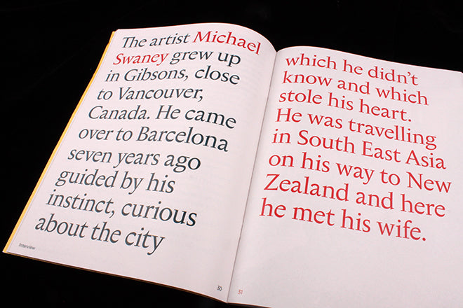
 As our daily routines give way to less tangible pursuits, it makes sense that ‘things’ are fetishized. We love ‘things’, from printed matter like independent magazines to prized objects we keep on our shelves, which are perhaps cheap in terms of their economic value but rich in terms of their memories. In Andròmina, a pair of worn shoes belonging to artist Michael Swaney sets his interview in motion (above) – each tear and stain unlocks memories from his travels around the world. An article written by furniture restorers Blom & Blom centres around a treasure hunt in former DDR second-hand shops (below) – it’s an exploration of how junk can be transformed and how old memories can be re-written or revised.


Other ‘things’ of note: an essay on a coin collection (above) finds the stories hidden in a dusty archive, and a thought-piece on William Gibson, cyber-objects and the Internet (below) is subtly unnerving. For the latter, a switch to a glossy paper-stock for the accompanying imagery evokes a slippery silver screen – inviting you to think about the materiality of objects and how we experience them on a computer.

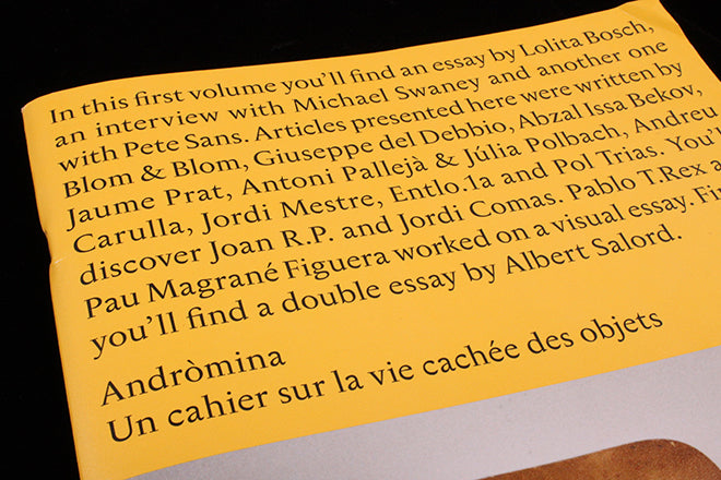
 Unlike Amuseum, which teams with visual cornucopia, Andròmina takes the opposite approach, using words to conjure an object as opposed to illustration. It’s elegant and simple – boldly typographic, with little further adornment other than occasional flashes of red to guide a reader’s experience (above). From the magazine’s beginning, the design very much ‘Does what it says on the tin’ – the contents on the sun-coloured cover delineates exactly what’s inside, and each article is laid out so that it can be read with comfort and ease.
Editors: Albert Romagosa, Tai Sans and Arnau Tasies
Creative direction: Albert Romagosa


