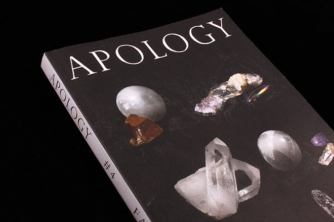
Apology #4
For Apology magazine, everything goes.
Whenever I discuss independent mag publishing with anyone—and in the occasional moments that I seriously consider whether I should join the mag-making club and create my own from scratch too—I always find myself concluding that if you’re going to do your own mag, it has to be about a niche topic, something like cats or saxophonists or sushi. There are so many publications that are incredibly wide-in-scope, so I often feel like it’s best to do something wholly original and un-catered for. Find a gap, and exploit it. But then I see a magazine like Apology, and I make no apologies for completely changing my mind.
Apology is “a general interest magazine for people whose general interests aren’t general” as it says on its website. It’s a “make-your-own-pithy-observation-that-goes-here” kind of magazine. Inside, there’s a collection of whatever the editor finds enjoyable, a free-range combination of essays, art, photography, humorous snippets and short stories. It might sound old fashioned, but the approach makes it contemporary. The magazine was started by former Vice editor Jesse Pearson out of a desire to evolve and move away from the fast-pace, time dependent, abrasive journalism that he’d become used to, and it also became a way for him to reassess whether literary magazines could also be stylish and more aesthetically open. Jesse wanted to make a publication that reminds readers of people that get forgotten in a world where journalism is increasingly fixated on finding the next big thing rather than exploring things that were popular a few weeks ago, or not at all. It creates its own abstract topicality.
 Issue four is eclectic: there are lists that remind me of the kind you find on McSweeney’s Internet Tendency (like a list of available answers to the question ‘how are you?’, above), reviews of weed decorated with a hodgepodge selection of green typography (also above), and an article on cartoonist Sally Cruikshank (below). There’s also short stories and enigmatic photography by artists like Mary Manning (also below). The typography and design shares this eclecticism.
 Why the glittering gem stones on the cover? Perhaps it’s something to do with the brief editor’s note at the front, which grandly announces : ‘At long last, the fourth issue emerges like a phoenix from the smouldering wreckage of the recent past’. There hasn’t been an issue for a while. Apology does what it wants, when it wants, including putting random bling on their cover—a perfect example of the open, flexible potential of independent publishing. Independent titles don’t always have to be niche and specific, they can also be a mood, an energy, and a tone. And they don’t have to say sorry for it either.

Buy this issue of Apology from the magCulture shop.


