At Work With: Claudia de Almeida, Wired

After several years working on magazines in New York, including More, New York and Men’s Health, Claudia de Almeida recently moved to San Francisco to join Wired magazine as design director. Her redesign of the magazine has just been revealed in the June issue.
Where are you today?
I am on our August cover photo shoot in NY.
What can you see from the window?
New York City! It’s weird to be back here. I left on January 25th for San Francisco, and this is my first trip back. I lived in NY for 12 years and when I was offered the job at Wired I just finished up my 2 weeks at Martha Stewart Living Omnimedia, packed my apartment, and moved across the country all within 3 weeks.
How many emails are waiting in your inbox?
Not many. Everyone in the West Coast is still sleeping.


What’s your favourite magazine this morning?
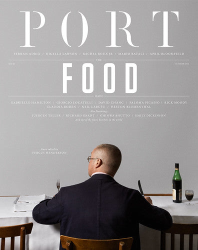
I really, really like Port. I also really enjoy Elephant. I don't know Matt Wiley personally but I am a huge fan of his work. I am a huge fan of anyone that can take a typeface and use it in a way that makes it feel fresh; where the type commands the space but doesn't feel overwhelming. It makes the whole experience of reading a magazine so much more enjoyable. I also think the photography is really dead-on.

What’s been the most exciting thing joining the Wired team?
Everything? Wired has always been a dream job and here I am, it's so surreal! I feel really privileged to have had the opportunity to work on the 20th Anniversary issue. That was special. It was like getting a giant brief to do the redesign. It was an especially challenging issue but the design team is amazing and worked really hard, I'm so proud of them.
One of the most exciting things about this position is getting to work with truly inspiring and supportive people. I have had the pleasure of working with Carl de Torres on the titles for each of our front-of-book sections. And Margaret Swart, a Dadich/Wyatt Mitchell alum and our Design Development Editor. Having both of those guys’ support was huge in making me feel welcome and ready for this job! Then, there is Scott Dadich. He is brilliant.

What was the brief for your recent redesign of the magazine?
The Anniversary issue (above) was kind of the unofficial brief. I learned so much about the culture of the magazine and its story taking on that project. When it came to the redesign I had a pretty good idea of what I wanted it to feel like and what Scott envisioned as well. However, redesigning Wired was very, very difficult. There was just so much to consider in a small period of time.
Scott and I had a few conversations of what we wanted it to be when I first started, but he left it pretty open-ended. He wanted a big idea; he wanted a nice format but something fun and not cold. And that’s one of the things I like most about working for Scott; he rarely tells you what to do, he likes to be surprised.
How is it working for editor-in-chief Scott Dadich, ex-creative director of the magazine?
It’s great. Scott is always forthcoming about how he feels about, well, everything. I find that decisiveness to be very refreshing. It makes it easier for me to do my job if I have a clear idea of what works and what doesn’t.
What was the last thing he said to you?
That he was excited about the idea for our next cover (September)! So am I! There are so many exciting things to look forward to this year.
What are you most looking forward to this week?
Getting started on August and planning the September Issue.
What are you least looking forward to this week?
Going over the shoot expenses. That’s never fun.
What will you be doing after this chat?
Heading to the cover shoot!
See more of Claudia’s redesign in our recent post, and her other work on her website.


