At Work With: Ji-Young Ahn, Neon

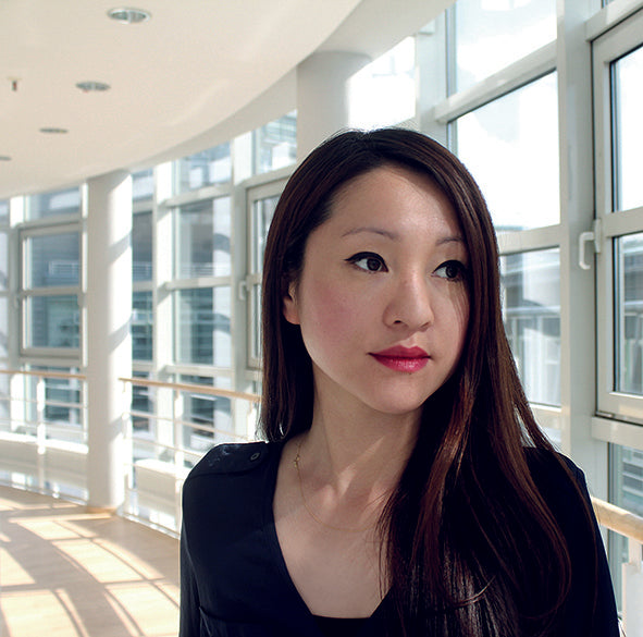
I’ve been in Europe a lot recently and I always return with a copy of Neon – it’s such a refreshing, crisp example of editorial design and art direction. So it’s exciting to be looking ahead at the week through the eyes of the magazine’s art director. Ji-Young Ahn studied communication design in Düsseldorf and has worked on a number of magazines including co-publishing (with Johannes von Gross) her own magazine NUR. We join her as the Neon team complete their move from Munich to Hamburg.

Where are you today?
In our new office, right by the port of Hamburg.
What can you see from the window?
I have a very nice view of St. Michaelis Church, one of Hamburg’s landmarks. There is a trumpeter standing on the tower playing a choral in all directions every day. Downstairs there is a small park with a public coin-operated barbecue machine—which sounds kind of weird but it is used quite frequently.
Are you a morning or evening person?
Definitely a morning person. Though some mornings I feel that I actually am a night person.


Not everyone will know Neon – can you explain a little about the history of the magazine?
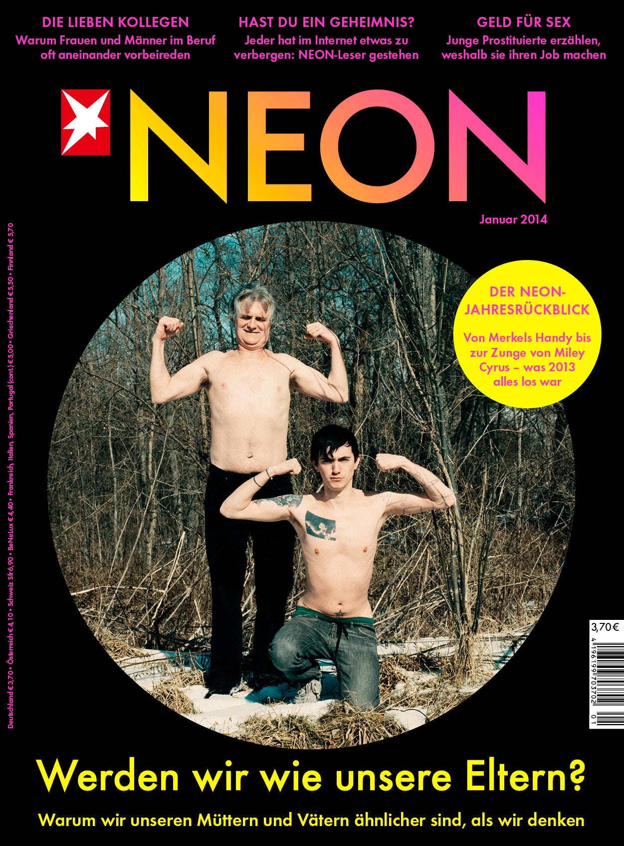
Neon is a monthly general interest magazine founded in Munich eleven years ago. It is a spin-off of German weekly news magazine Stern and belongs to the publishing house Gruner+Jahr. Targeting people aged 20 to 35 it deals with a wide range of topics such as politics and pop culture, education and job, love and friendship.

The design and art direction is very pure and sophisticated, quite unlike other magazines for twenty-somethings. Explain the approach.
As we are publishing both very serious political features and funny nonsense stories it is important to us to keep the design very clear and simple—like a big blank container everything fits into. The typography should be strong and distinct but shouldn’t compete with the actual content. So when relaunching Neon last year I chose two very classical fonts (Futura and Times) and specified only very few style modules that are supposed to work in all combinations and for all kinds of stories.

Although photography is central to Neon’s visual appeal, there is plenty of detailed typography, and illustration. It must be hard work preparing each issue – do you have a large design team?
There really is a lot to do but I am very lucky to work with an awesome team. Currently there are three graphic designers, two picture editors and me and my colleague Manuel Kostrzynski, who is responsible for all digital designs, i.e. the iPad version of Neon, our blog and the community website. And of course we work with a whole bunch of very talented and inspiring freelance illustrators and photographers all over the world.

From time to time there are special Neon projects like books and games. Our graphic department designs those, too. Two new books will be released this autumn: “Ich hätte gerne eine LSD-Leuchte” and “Unnützes Wissen Tiere”.

What are you most looking forward to this week?
Neon moved from Munich to Hamburg (which is 800 kilometres north from where we used to live and work) only two weeks ago. So I am still exploring my new hometown with friends and colleagues.

What are you least looking forward to this week?
Tax declaration...
What will you be doing after this chat?
Monday morning meeting with the staff. Today our July issue has been released so we will discuss the pros and cons of the issue. Like every release day.


