At Work With: Mark Neil, NME

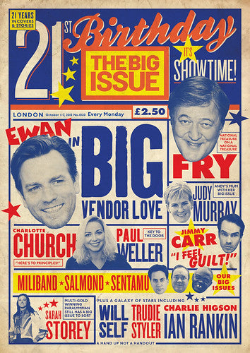
Mark Neil first came to notice with a series of bold front covers for the Big Issue, first for the Scottish edition and later the UK one. Earlier this year he took up the role of art director at Britain’s oldest music weekly, NME, and last month unveiled a complete redesign of the magazine. Here we look ahead at his week as Lou Reed’s death disrupts the final stages of production.
Where are you today?
I’m at NME at IPC on the 9th floor of the Blue Fin building, Southwark St, London.
What can you see from the window?
Our desks are in a corner of the building. So straight ahead I see that tower at Elephant and Castle - the one that looks like a big electric heater with three propellers? I’m still a relatively new boy here and keep forgetting names of buildings and streets. To my right it’s more familiar, the London Eye and Houses of Parliament are in the distance but closer we can look into extravagantly over-priced new build apartments. These places should really have curtains or something. You don’t want to know… We see some lovely sunsets though…
How many emails are waiting in your inbox?
Curiously, it grows and grows as soon as I sit down at my desk but about a third read “Mailbox full, please delete some messages.”

What’s your favourite magazine this morning?
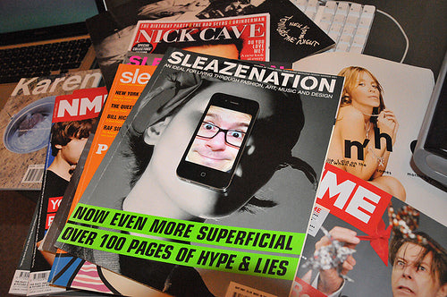
It’s still Sleazenation. I recently revisited my copies after seeing Scott King's talk the other week. When I left college most people would go travelling, take a year out, but for some reason I was eager to start work. I would regularly visit Glasgow to knock on some doors and talk with designers (translation: prop up some bars and drink with my pals). I regularly found myself in Mo’s, a 24-hour store in Glasgow. Mo’s always had Sleazenation. I was more of a country boy and picking up that magazine in the city was a new experience for me. There was something special about buying magazines I couldn’t get at home back then. I miss that feeling; Scott’s talk reminded me of it.
Now, great magazines are everywhere for you because you can connect to them via Twitter etc. But there’s nothing like picking up the real thing and having a flick. When Big Issue was at Dennis, we had Charlotte Street News around the corner - that’s a great shop! I’d love to know where the best magazine shop in the Southwark/London Bridge area is, asides from Tate Modern. Do you know where one is?
Working at the NME you are of course listening to music right now. What are you listening to and how (iTunes, Spotify, vinyl....)?
Some, mad, head thumping electronica that is really just a noise. I don’t care who or what it is, it’s just a noise. It’s coming from the art desk speakers and its making my head hurt. Yes, we all have speakers on our desks. We channel into the music that is played on CD, computers, online stream and people’s iPods. The job keeps me up to date with good bands though, this stuff just isn’t my cup of tea. The Uncut boys (Uncut magazine are our neighbours on this floor) have Neil Young on so I’m insanely jealous of that. That’s more my thing. In fact most of my music taste belongs in their territory. I have an older soul. When deadline Friday comes, Tony (Ennis, my deputy) and I like to rattle the office with Michael Jackson’s Bad. You can imagine that raises a few eyebrows on this floor…


What differences have you found in your weekly routine since moving to NME from The Big Issue?
From 2011, The Big Issue editorial team was based primarily in Glasgow and the production team of art director, designer, production editor and sub-editor based in London. I was working remotely from my old editorial team in Glasgow. So most meetings with editorial were frustrating conference calls rather than in person. I really missed being part of the editorial team and feeding off everyone’s ideas and thoughts throughout the day. With the NME we’re all together so I guess that is the main difference to my routine. Mike (Williams, editor) and I are able to work really closely and it’s easy to grab each other for a chat and quickly make decisions.
There’s a lot more I need to keep my eye on compared to The Big Issue. I don't just look after the magazine but everything else involving the brand: the online, digital, marketing and external design work too.


One thing I think I brought to NME from The Big Issue however is a more thought-out approach to the front cover design. I'm still proud of my first NME cover from April this year - Yeah Yeah Yeahs' Karen O, The O-Team cover. People noticed the change to the approach and I wanted it to be different. I needed these covers to have an idea, not just a bunch of blokes with haircuts and beards talking about their new record.
I'm lucky to have a good photo desk who work next to us. Tony is to my left and Zoe Capstick our photo editor is to my right. I see our combined photo and art desk as one little studio that makes things look the way they should for the brand. We'll soon have some new additions to the art team too - one being an online designer who will work with us on a new NME.com and other digital work. It's an exciting time as we head into this new era.

The new NME feels more vital than it has for ages. Describe what you were trying to achieve with the redesign.
Just that. I wanted it to be important again. With a 60+ year history, people of all ages are always going to have opinions on the NME overall but this music weekly should always create debate. I essentially wanted people to not be afraid of it anymore. We wanted to create this feeling of being part of something, a club. So it needed a new editorial approach and visual voice to make that connection.
The first decision was to downsize, the awkward width of the old NME seemed to influence an unnecessary amount of images on the page. My intentions were to reign that in and control the content more. Concentrate on the quality over the quantity. Plus it just feels more like a weekly should now.
It was very important for me to give it this voice, a visual language something that the NME lost. This is achieved from the little bits of character in the copy through to the DIY, cut and paste feel to the type and images on a multicolumn grid. I purposely chose type that has timeless qualities. Lucas Sharp's Sharp Sans is a perfect marriage of classic geometric forms and retro character for the identity I wanted to achieve. We have an identity now and one we can build on going forward. What is also crucial is applying this creative identity to other things under IPC's umbrella like our subscriptions ads (below, designer Dani Liquieri).

I wanted the features to be a different section in their own right, a meatier read at the back. And they needed to look more intelligent and talk harder to the reader.

We’re four issues in to the new look and I’m immensely proud of what we've achieved with such a small art team. Last week's issue was a massive list issue but a regular edition too and Tony did a brilliant job putting this together so close to our launch. It's also a bit of a dream job this, I get to combine two loves - music and magazines. I have to pinch myself sometimes. When I was younger, I used to sit up, listen to John Peel and read NME. I can't believe I've redesigned this iconic brand. I hope it really connects to people.

Should we mention Graham Roundthwaite?
Ha! You can if you like… to the trained eye, it’s obvious I love Graham's work for The Face. All that Phil Bicker talk was just… well… Bickering? Late 90s, early 2000s editions of The Face, along with Sleazenation, i-D and Dazed & Confused are responsible for the beginnings of my love affair with magazine design. Ultimately, I wanted to look back to go forward with this redesign. And The Face was one of many magazines that created this particular iconic connection between a brand and its audience I was trying to achieve with NME. But equally, I was just as inspired by older, retro magazines like Life, City Limits and NY Rocker as well as Barney Bubbles’ NME work. It's a massive compliment for me if people liken it to The Face but scratch and sniff and you'll find we're a different beast.

What was the last thing your editor said to you?
“You cool to be in early tomorrow?” Sunday evening, via text. Lou Reed has died but our cover this week, Arcade Fire, has already been printed. Looks like we’re changing some content though.
What are you most looking forward to this week?
• Seeing my girlfriend more.
• Seeing what people think of my Arcade Fire cover…

• Nick Cave and the Bad Seeds at the Apollo tonight.
• Planning the next few issues - we're just finding our feet with everything and I have some exciting stuff to work on right now.
• Did I mention “seeing my girlfriend more”?
What are you least looking forward to this week?
Everything looks OK for now but I’d have to say, going home. Not because I never want to leave work but we have a curious, unsolved, coming and going, bad smell in our flat. And it’s not me or she!
What will you be doing after this chat?
First, I need to work out what were doing with this last minute Lou Reed content. We also have a couple of late pages to tidy. We need to send these last pages to the printers by 11am.
Once this mag is done, Monday is a bit of a catch up day for me so I have some time to work on other projects. I need to come up with some ideas for our NME Awards 2014 logo. Brief is very open to go wild with so it should be a lot of fun. I'll also be meeting with our designer to chat over some design work for a CD we're doing. Hopefully, I can find a bit of time to finally sort some styles and templates for our redesign - this never got finalised for the launch due to our manic workload and there's always some style tweaks to do a few issues in to a weekly's redesign. Punters don't notice this stuff but I do. But i'll make sure I leave on time. I have an evening with Nick Cave.


