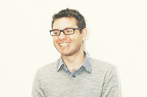
At Work With: Rob Alderson, It’s Nice That

We kick off the week with a look ahead at it through the eyes of Rob Alderson, editor of the It’s Nice That website and their new magazine Printed Pages, successor to the It’s Nice That magazine.
Where are you today?
Our studio is just off Shoreditch High Street in east London, in the beating heart of what I’ve heard excruciatingly referred to as “the flat white economy.” It’s the one time in the week my desk is tidy and the magnetic board next to me is already filling up with magazine, blog and podcast ideas. There's also a picture of television choirmaster Gareth Malone who one one of my colleagues has recently decided I look like.
What can you see from the window?
A tiny patch of grey east London sky and a sliver of the trendy flats above us. Natural light is at something of a premium in our studio and I had to plan the team layout carefully to get a seat directly underneath one of the rare windows.
How many emails are waiting in your inbox?
About 80. I am trying to wean myself off checking them so regularly over the weekends but I still caved several times and cast an eye over them to make sure there wasn't anything super important. The thing is the website/social media obviously doesn't take the weekend off and things can crop up at any time. See also holidays, bank.
What's your favourite magazine this morning?
Port at the moment. It’s not just the way it looks and feels but the content is genuinely engaging because of the quality of the writers they use. One of my biggest frustrations is being sent new publications where all the energy and effort has been expended on the design at the expense of any good content.

The name Printed Pages is a very definite vote in favour of print. How do you see the relationship between it and the It’s Nice That website?
One of the reasons for the name change with the new magazine was to differentiate it from the website. My focus since becoming editor has been to try and ensure the DNA stays consistent between the two platforms but there's no point in the two trying to do the same kind of things. Our passion for print comes from those characteristics which make the experience of reading a magazine so special - the tactility, the smell, the use of imagery, the happenstance of stumbling upon something unexpected. We want to embrace those qualities with Printed Pages while using the site to do those things that are great about online publishing.

What was your favourite element of the launch edition of Printed Pages?
Can I have two? One is the cover which I love and I think when you see it in bookshops it really jumps out as clearly, immediately being something different. The other thing is how the content, the design and the price all combine to make it really accessible. We have always believed art and design writing can be fun and interesting without being dumbed down.

What can we expect from issue two (and when is it published?)
It will be out in June and I hope we can build on the successes of the first issue by repeating the things that were good about it and honing and tweaking those bits we believe can be even better. In terms of content I am going to plead the fifth. There'll be graphic design, art, illustration and photography. And there will be something very relevant to magCulture readers about the art of magazine design. That's all I'm allowed to say.

What was the last thing your magazine designers said to you?
Something about deadlines. They love their deadlines.
What are you most looking forward to this week?
My oldest friend is getting married at the end of this week.
What are you least looking forward to this week?
Doing the speech as his best man.
What will you be doing after this chat?
Making a start on those emails and taking down the picture of television choirmaster Gareth Malone (again).
More of Printed Pages here.


