At Work With: Shem Law, Radio Times

As Christmas arrives, households across the UK are planning their TV viewing using the seasonal double issue of Radio Times. First published in 1923 as the BBC’s exclusive guide to its radio and later TV services, the Radio Times remains one of the UK’s biggest-sellers and the double issue routinely sells more than any other single issue of a magazine in the UK.
We look ahead at Christmas week with deputy editor Shem Law. Responsible for the design of the magazine since 2001, Shem has previously worked on Q, The Observer, and The Daily Mail in London, and Allure and Seventeen in New York.

Where are you today?
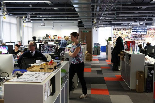
Sitting at my desk at Radio Times Towers which is in leafy Brook Green, Hammersmith. The 1930’s building was a former Lyon’s Cake factory. The floors are long and thin and we are arranged in, what an architect once told me was, ‘galley slave formation’ with desks in rows from stem to stern. My favourite part of the building however are the original numbers set into the floor as you step out of the lifts (below). Someone needs to make a whole typeface from them.

What can you see from the window?
If I crane my neck I can see into ‘Dead Dog Park’ over on the other side of the Hammersmith Road, so called because not long after we moved here from White City, a woman was walking her enormously fat dog in the park, on a very hot day. The dog stopped halfway across and lay down on its side and refused to budge. After an hour of her tugging on its lead and trying to lift it up we were convinced it was dead. But it was just knackered and finally got up and went home. I’m afraid it’s what passes for entertainment here in West London. More interestingly, there’s a plaque on the park wall that says it’s the site where Monty planned D-Day, so maybe it is more significant place than we like to think.
Are you a morning or evening person?
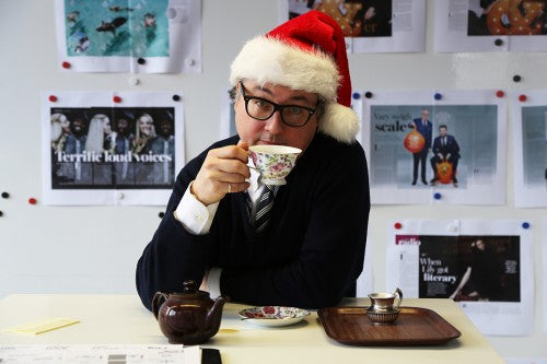
I used to be an evening person, when I started working we used to work until 8pm or 9pm, before decanting to the pub, and quite often coming back to work and sometimes sleeping in the office, before starting again. Those days are long gone. I get up most mornings at 6.30, getting various children off to school, pets fed, tea for my wife etc… but to be honest I shuffle through it like a zombie, and really don't get to grips with the day until my first cup of tea at 11am sharp, note that is tea, none of that coffee nonsense. Magazines are run best on tea, if you ask me.


What’s your favourite magazine this morning?
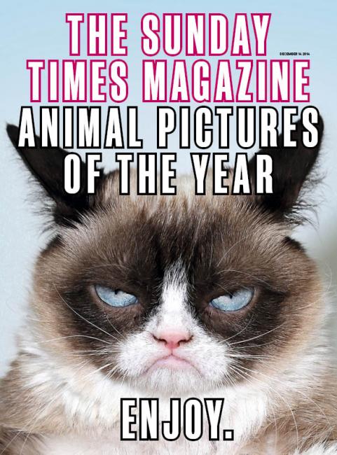
My wife was showing me the Christmas advent calendar edition of Country Life this morning which is terrific fun. I have to say that for the first time in quite a while I've started to look at the Sunday Times Magazine again. I think Matt Curtis is trying to do something different with it and appears to be making it much more like it used to be back in the ’60's and ’70’s, controversial and coming at populist features from a different angle. I can’t imagine that’s a very easy thing to do in a Murdoch run publication. I thought Eureka was a great magazine when he art directed that.


I started my career in newspaper colour supplements 30 years ago, was taught pretty much everything I know by John Tennant and I think consumer magazine people have always looked down their noses at supplements. Matt is a very interesting designer, and deserves a bit of credit for what he’s trying to do. Sam Walton’s Hole & Corner magazine is also a real treat, celebrating artisans and their craftsmanship. My first job from school was as an apprentice in a sign-writing firm and learnt at an early age that a degree in design doesn’t mean a great deal when compared to true craftsmanship.
And your favourite TV show?
Of all time, that would have to be ‘The Thick of It’, working on newspapers gave me an appreciation of seriously creative swearing. But at the moment, I'm really looking forward to the new BBC production of ‘Mapp & Lucia’ that’s going to be on over Christmas. Don’t miss it – middle class bitching at its best.

The Radio Times Christmas double issue has become part of the British Christmas. Give us some context for the tradition, and talk us through this years cover (above).
The Christmas issue is the biggest magazine we do all year, it generates a quarter of the our profits in a year and is one of the biggest selling issues of any magazine in the country. (In fact the 1988 Christmas Panto cover holds the record of being the biggest selling edition of any British magazine selling a staggering 11 million copies).
Like most weekly magazines, from the end of October we have to make a magazine every 4 days instead of the usual 5, and then there's one issue we do in 3 days so that we can get 6 clear consecutive days to produce the Christmas double (and get a break over Christmas). It comes out around the first weekend of December and traditionally heralds the start of Christmas proper.
The covers have traditionally been illustrated since the first Christmas cover in 1923. This year is no exception and started when Ben Preston, the editor, saw a programme about and then met Judith Kerr. She is the author and illustrator of The tiger who came to tea and the ‘Mog’ series of children's books. She is 91 years old and I think he was taken with the idea that the cover this year could be by someone the same age as Radio Times. I started work with Judith in September and she came up with this charming image (after a crash course in commercial magazine illustration that we administered over tea and cakes). She was really lovely to work with, sharp as a tack, nothing got past her. Also her cover really stands out on the newsstand, which helps in what has become a rather crowded market. The cover, I always say in my brief to illustrators, has to be like a Christmas card, it sits on reader’s coffee tables for nearly a month and really needs to fit in with those surroundings.
What’s the biggest challenge working on such a long-established magazine and to a weekly schedule?
The heritage of this magazine is huge, on a daily basis, you are reminded that you are just one of a long line of art editors or art directors that the magazine has had in its 91 year history. The 650 odd issues that I've worked on since 2001, pale into insignificance compared to the 4,600 or so that have been published since 1923. Luckily I have a fantastic team of talented designers and picture editors that make it all far less daunting. Paul Smith, my long-suffering deputy, celebrates 30 years on Radio Times in 2015 and what he’s forgotten about the magazine probably isn’t worth knowing.
As for the weekly schedule, I really wouldn’t have it any other way, there is such an understandable rhythm to it. (Christmas schedule apart) You make a magazine in five days and two working days later the first issues appear in the office. I've always found monthly schedules to be painful in the extreme. A weekly is far more tangible, responsive and alive.
You were previously Creative Director of the magazine but are now credited as Deputy Editor. What has that change meant day-to-day?
The editor that made me her deputy once said to me (paraphrasing from ‘The Godfather II’), ‘Keep your friends close, but keep your art director closer’. I think that’s pretty good advice to any editors out there. It just means that I'm involved in every aspect of the magazine, not just the design and layout, from feature ideas to budgets. They even sent me on a publishers course once, and I can report back that they really don’t have as much fun as we do.
Actually to be honest, the art director should be the ‘ipso facto’ deputy editor on every magazine anyway. Editorial designers should, in effect be part-time journalists, a good magazine just tells stories using pictures and words. Designers that would rather be stroking their chin’s in front of type books instead of working out how best to tell the story to the reader, really need to be designing something else.
Despite the availability of online and on-screen programme guides people still buy weekly TV magazines. What do you put that down to, and is that changing?
I’m afraid it's to do with the age of the readers, which isn't a particularly fashionable thing to say. I’m of the vintage, like them, that would still rather pick up a magazine and find out what's on TV, than use the TV’s own electronic guide and luckily there are a great deal of us out there. But, you're right it is changing and Radio Times has a website and an app and an apple newsstand edition out there for people that prefer screens to print. I have found though, once you get the printed magazine into peoples's homes and they use it for a few weeks, it becomes indispensable. My teenage daughters who don't buy any print media at all, can often be heard shouting ‘Who's had the Radio Times?’
What are you most looking forward to this week?
Finishing up the week 3 issue and getting home for Christmas and spending some time up in North Norfolk.
What are you least looking forward to this week?
Lugging all the presents home that I’ve accumulated here at work, most of which I have to say are Radio Times branded. A magazine needs as many revenue streams that it can get these days and I figure that if I’ve spent most of the year designing tea cosies, jigsaws, a Trivial Pursuit edition, a book about the classic photography of Radio Times, then I can give them as presents. And if any of my family are reading – I didn’t get them for free. (Though there is a a fairly healthy staff discount!)
What will you be doing after this chat?
I'll be making a pot of Assam, as it’ll be 11 o’clock on the dot.


