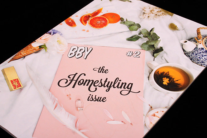
BBY #2
Great things often happen when illustrators start independent magazines, as we’ve seen with Dan Stafford’s fantastically eccentric, highly stylized Amuseum. Sweden’s much-loved Sara Andreasson has also been making magazines alongside her vibrant editorial work: in 2014 she teamed up with close friend and curator Josefine Hardstedt to start BBY, and this month marks the long-awaited release of issue two.
This second edition has been named ‘The Homestyling Issue’, and it explores an interior design theme through contributions from creatives that identify as female/ queer.
Sara and Josefine say that their choice of theme is a ‘critical’ yet ‘tongue-and-cheek’ response to the highly aestheticized world of interior décor: ‘It’s about domestic spaces and how we style our lives in order to fit into the globalized and homogenous visual culture of home decoration magazines and life-style blogs,’ they explain. So this issue of BBY is a kind of Apartamento-meets-Mushpit-meets-Buffalo Zine publication that’s sprung from the world of Instagram and which radiates a distinct female power and energy. It’s playful, satirical edge is obvious from the get-go when you see the punchy, cartoon-y (and distinctly ‘anti-design’) typography:
I also enjoy the meta cover: the front is a set-up of how you might post a picture of BBY on Instagram, and the back is the ‘reality’ of reading the mag in a bed strewn with mess in a Tracy Emin-esque fashion (below).
The magazine begins with a selection of illustrations of homes, including work by image-makers like Cynthia Kittler (above) and Zeloot. Next comes a down-to-earth article on home-styling, followed by an essay by woman type-designer Kimberly Ihre who talks about carving a kind of typographical ‘room of ones own’ for female designers (below).
Liv Siddall interviews ceramist Karin Hagen, and then there’s also a section of “home visits” with various creatives (above). I like the top home-décor tips from ‘bby’ Rebbeca Storm, who teaches you how to ‘make your home more alive with living things’ (below). This is followed by a punchy article on why you should only have white bed linen; the author uses the theme of ‘whiteness’ to have a go at titles like Kinfolk and Cereal (also below).
Issue one of BBY was almost like a pilot: it was 44-paged and zine-sized, and it featured work by image-makers that the editors admired, so mostly punchy, colourful illustrations by the likes of Laura Callaghan, Annu Kilpeläinen and Hattie Stewart. Its aesthetic taste was and still is similar to what you might find in Editorial Magazine, but with a distinct European edge and flair. In many ways, issue one was what we’ve described on the Journal before as a ‘Platform’ magazine, and at magCulture we often wonder what draws creatives to make these portfolio-showcasing magazines. In the case of BBY, the pilot was a chance to hone tone and aesthetic; mag-sized issue two is now an assertion of BBY as a fully-fledged magazine with its own editorial vision, thoughtful articles, and commissioned images.


