


Bellissimo #1
It’s golden hour at Ostia beach, and issue one of Bellissimo has sought to capture it in all its glory – oily bellies smudgy with grey sand, bleached hair, speedos, cigarettes and flash photographs of half eaten calamari.

A new project by photographers Paolo Zerbini and Ivan Ruberto, Bellissimo is dedicated to ‘places that are commonly unknown, snubbed, derided’, hence their coverage of Ostia, a far cry from the kind of Mediterranean fishing village that generally graces the covers of travel mags.
Perhaps that’s why it feels so rich a publication – without the usual glossy compilation of olive groves and medieval hilltop villages, the magazine relies on what Zerbini and Ruberto describe as ‘glorifying the understated’. The photographs are reminiscent of Richard Billingham or Martin Parr’s work, a stylised reality somewhere between the truth and satire.

It’s certainly an atypical travel guide, but despite this, Bellissimo surprisingly contains its fair share of niche restaurant and hotel recommendations, revealed in a piece called ‘MY ROMANTIC OSTIA’. Beyond this there is little useful advice – even the horoscopes are tongue in cheek.

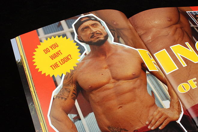
One of my favourite double page spreads, entitled ‘GET THE LINGO’ has compiled a banana-yellow list of ‘useful phrases’ one might find themselves in need of during their day at the beach; from ‘STO A SCHIUMA! – I am rather overheating’ to ‘STO SCANNATO – I am having financial difficulties’. These pages are indicative of the overall tone of the zine: bright, funny and fantastically irreverent.

But for all its irreverence, Zerbini and Ruberto have clearly put huge amounts of consideration into Bellissimo; every single page has been designed exceptionally well. It almost tricks us into believing it is a cheap tourist beach read, but Bellissimo is a touch too tasteful to really persuade, perched in that sweet spot between ironic ‘retro’ design and outdated imitation vintage.
It’s a pleasure to spend the day at Ostia, to soak up the heat and light of each page, to admire the oranges, greens, yellows and pinks that work so well together. It is genuinely funny too, and we’ve all been invited in on the joke.