Bricks from the Kiln #1
What if you approached magazine-making as if you were constructing and building, handling sturdy brick and cement instead of more ephemeral paper and glue? What if you imagined each piece of paper as if it were a brick that you lock together through binding and design, and which eventually culminates as one overall structure that houses ideas and potential themes?

That’s what London-based design magazine Bricks from the Kiln have done for their launch issue. Each body of content is “a piece of a larger structure” as the editors explain in their Afterword (an inside cover fold out, above), every essay, photograph or typographic flair a “part of a sum”.

If the magazine were an actual building, it would be tall, brown, looming and old, there’d be a lot of writing scrawled on the walls and plants would be growing through the windows. But upstairs, there’d also be a shimmering, modern and geometric glass addition to the structure.
This is because Bricks from the Kiln contains both classic essays that look at the stories in the bricks and sturdy pieces of design that are already around us - Iain Sinclair’s 1970s Westerings (above) is a compilation of notes from time spent journeying through the landscape of the West Country, for example - but it also looks at contemporary structures and projects too. An insert (below) by Max Harvey, He Papuan & Li You of abstracted photographic compositions that focuses on consumer objects found in Beijing is one example of what might sit in the shiny glass box on top of the imaginary, crumbling Bricks from the Kiln tower.

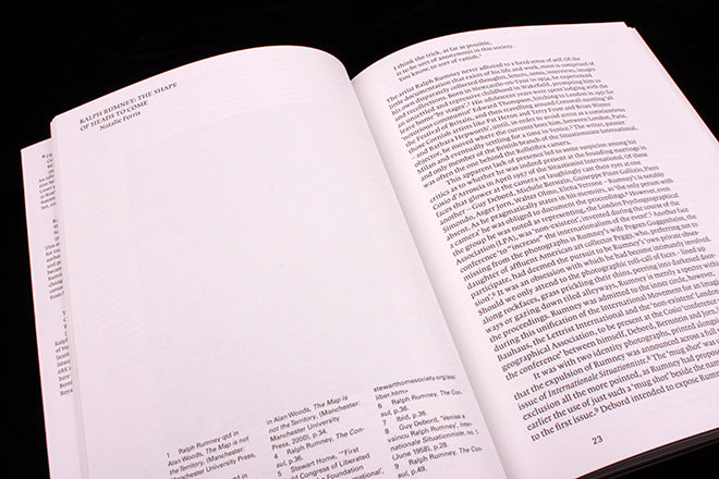
All the essays and visual projects featured in the magazine seem to have one central way of thinking that strings them together - and which gives the publication its overall shape - and that’s an echo of the ideas of Guy Debord and the Situationists. The magazine’s content (as well as overall design – the layouts make a feature of the grid and structure) is about transforming one kind of material into a new structure: the essays and showcased projects might bring together seemingly separate objects found on a street (like in the photographic inset) to create new narrative shapes. You can especially see the influence of Debord in an essay that reads the anarchism inscribed on city streets in the form of graffiti (above), and in Natalie Ferris’ essay that traces the ghostly presence of artist Ralph Rumney (below).

There’s also contributions from avant-garde graphic designers Traven T. Croves (above, he also designed the issue) and Mark Owens (also above), and an essay by the self-organised art and design educational group Parallel School (below).

In their Afterword, editors Andrew Lister and Matthew Stuart site the design magazines that have set a precedent for BFTK: they’re informed by the likes of Typographica, Icteric, Dot Dot Dot and Situationist Times. Of particularly note for them is Theo Crosby’s Uppercase, which ran from 1958 to 1960: it brought together work from ‘the whole field of visual communication’ and struck a balance between historical research and current projects. It’s a combination that BFTK are evidently interested in too.
There are a lot of design magazines around at the moment, and many magazines that care a lot about their design - and a lot of these design and well-designed magazines are in a rut, recycling similar tropes and aesthetics. BFTK suggests a way of making a magazine that’s both well designed and about design that breaks from the mould: the editors suggest you can make a publication by not even thinking of it as a magazine in the first place. They suggest that you can make a magazine by envisaging that you’re constructing something else: you can use paper, ink, words and photos as your material, but transform them into some other shape and structure of your own imagining.


