Christine Murray, Editor, Architectural Review
This wintery Monday morning we’re joining editor-in-chief Christine Murray to celebrate the 120th birthday of the London-based Architectural Review. Published since 1896, the monthly has included contributions from D. H. Lawrence and Evelyn Waugh in the past, as well as graphic elements designed by the likes of Eric Gill and Edward Bawden. In 1935, the magazine acquired a leading position in the discourse surrounding Modernism, and during the Second World War, the journal was hugely influential in raising awareness about the importance of urban design.
Today, the architectural magazine continues to publish monthly. A kaleidoscopic cover announces its December/January birthday special, which includes rare and unseen archival pieces including writings by Le Corbusier, Colin Rowe and Reyner Banham. We catch up with Christine as she looks back at the AR’s 120 years and begins to think about the next issue.
How was your weekend?
Delightful mayhem with my energetic two year-old daughter and seven year-old son.
Tell us about your journey to work.
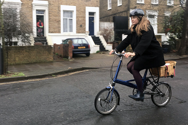
After the school-drop scramble, I cycle from Dalston to Old Street through the backstreets on my trusty 1974 Moulton Mk3. It’s twenty-five minutes of bliss and when I get my best ideas. In stolen moments, I read novels, children's books (to my kids), magazines, the New York Times and the Guardian.
Describe the state of your desk.
I’m restless, so I change desks often, perching with my laptop where it suits me, leaving a trail of printed proofs, stolen pens, drained mugs, my wallet, mobile phone and notes. As a result, I can often be heard saying, ‘Has anyone seen my…’
Which magazine do you first remember?
Sassy as a pre-teen. In high school, Ray Gun and stapled-together, photocopied black-and-white zines.
Which magazine matters to you the most today?
There isn’t one, it’s a mash-up of influences, some of them half-remembered, almost imaginary, others taken from a page here and there. I’m restless, hungry for a magazine that doesn’t appear to exist. I used to read Cabinet for the eclectic mix, but lately I’ve been spending a lot of time in the archive of the AR, which is a pretty amazing place to get inspired.
The anniversary issue looks back at 120 years of the magazine; which (apart from your own!) was your favourite era?
The 1950s – especially the covers and the mix of papers, and the all-killer, no-filler content. Every page evokes an oh-cool-look-at-this, which is what I love about magazines – they are best when they’re full of surprises.
Other architecture magazines have failed to last such a time. What keeps the AR going so strong?
Once you get to know the brand, you can’t help but fall in love with it. The passion that the AR engenders is intoxicating for both its editors and its audience. It’s critical but not cynical, intelligent but not smug, playful without irony, it’s wary of fashion and genuinely loves architecture. This also means we don't do anything by halves: there is no cheap and dirty content. Every building we cover is visited by the writer, the pieces are always over 1,000 words, sometimes over 2,500, and we commission a lot of original photography. This can mean writers and photographers traveling for hours, hiking up a Honduras mountain, or through Chinese mountain passes to report on buildings for us.
Pick a spread from the new issue and tell us what it says about your magazine.
In 1936, Lazlo Moholy-Nagy took the photographs and did the graphic design for a special article on the seaside featuring this amazing die-cut. For the anniversary edition, we created a spread inspired by the original (above). It speaks to our avant-garde history of playfulness and the sense of craft and event we still put into every issue. Our printers – Headley Brothers – do a tremendous job. We cram in as many special treatments and paper changes as we can afford – as a result, the anniversary edition alone took a day and a half to bind.
What are you finding most frustrating about your work this week?
We sold out of our November issue – the Death issue (above) – and we have just three left. I wish that I’d printed more – it's too expensive to do a second run.
What’s going to be the highlight of this week for you?
Going to press with our next issue, which means all the thrills of being an editor: writing my column, eagle-eyeing every spread, working some magic with our art director and seeing it all come together.
What will you be doing after this chat
Checking in with jelly-makers Bompas & Parr who’ve cooked up something special for our next cover. The big photo shoot is this afternoon and I can’t wait to see the results.


