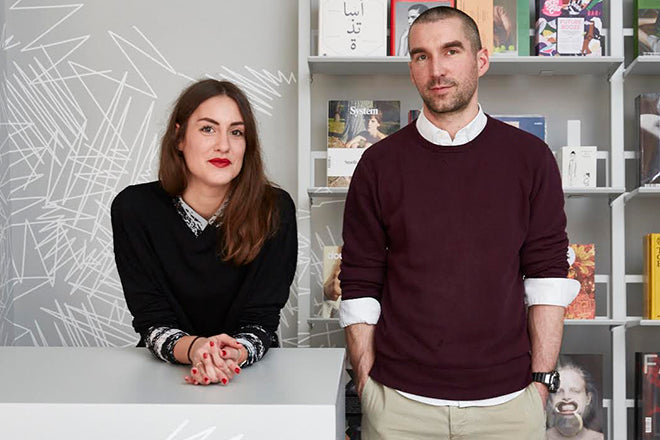
Luke Tonge, art director
To start of the new year, editorial designer Luke Tonge is taking us through his magazine favourites. Previously art director at Boat magazine, Luke now designs Monotype’s The Recorder, which is celebrating the release of issue four this month.

As per usual, we asked Luke to select three magazines - an old issue, a new one and a graphic design detail that he finds especially excellent.

An old issue: Print, 40th Anniversary Year
Print is an institution. Old issues of Print act as a physical time capsule from an era of graphic design that fascinates me, and this special typography issue from 1979 is the pinnacle. Guest edited, art-directed and designed by one of my design heroes, the pre-eminent Herb Lubalin – its deceptively simple typeset American Flag cover has rightly become iconic (beautifully explored & animated in this issue of Flat File).
I get my copy out every few months just to remind myself how good its cover is! The bulk of the issue is an overview of 40 years of graphic design as selected by Lubalin, laid out quite unremarkably. The period ads and tipped-in paper samples have nostalgic and curiosity value, but my oh my, that cover...

A new issue: The California Sunday Magazine, The Sound Issue.
Although its only been around for a couple of years and its not always easy to find in the UK (apart from the trusty magCulture store) The California Sunday Magazine has quickly become one of my favourite magazines. It's understated, beautiful and smart – long-form print at its very best – and never feels like it's trying too hard. It contains brilliant stories, photography and illustration about 'the West, Latin America and Asia' and is astutely directed by the wonderful Leo Jung (his Wired/ New York Times pedigree shines through each issue).
In an age of big bulky mags, its slinky feel and handy size enhance its assuredness, and this issue from October has an added layer of intrigue – Sound – answering the question "What do California and the West sound like right now?". Affordable bi-monthly print at its best!

And another thing: Baseline Magazine cover wraps
Baseline has long been an inspiration to my editorial design mindset – its confidence and boldness is apparent from the moment you pick up any issue with its signature ‘double-cover’ structure. These oversized folded wraps are visual gems themselves and often hide unexpected treasures underneath. Not always practical, or cheap to produce, but they help take Baseline to another level and are probably my favourite thing about the mag, proving sometimes it is ok to judge by a cover.


