

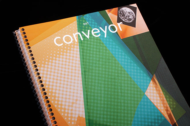
Conveyor #7
With Elana Schlenker of Gratuitous Type – the glorious journal of ‘typographic smut’ – as one of the designers at the helm, it’s no wonder that Conveyor magazine are infatuated with typography and jump at every opportunity to experiment with and celebrate it. The strikingly tactile, ring-bound publication is a project by the Jersey City-based print studio and bindery of the same name, and whilst Conveyor is primarily a photography magazine, designers Elana and Christina Labey find playful ways – like the typography – to extend each issue’s theme beyond the photos.
Issue six explored the idea of analogue photography through the theme of ‘alchemy’, and Elana commissioned a typeface that morphed and changed over the issue to evoke a chemical process. ‘We loved that multi-disciplinary approach to the ideas of that issue,’ says Christina, ‘So we decided to do it again for the Time Travel issue.’ They commissioned Icelandic studio Or Type to design the special typeface for issue seven, and the foundry set out to create a timeless font rich with ephemeral references.

 Each character has several different designs, each separate design representing either the past, the present or the future. Words are then created through varied and random combinations of the characters: the result is a spiralling typographic Tardis, a contemporary sans serif with an ever-changing sense of time. Or Type’s font is used for headlines and titles (above) as well as some bodies of text like the Editor’s letter (below), and this creates cohesion in an issue that otherwise rockets backwards and forwards temporally.

 Author names are also written in the custom font (above), as are drop caps, two subtle but effective details.
 For the ‘present’ characters, they selected the typeface Las Vegas as their foundation – a font based on the painted letters of road signs and which is embellished with curves. For their ‘past’ characters, Or Type were inspired by uncial script used during the Middle Ages (above), and for the ‘future’, they took inspiration from Star Wars’ fictional Auebesh alphabet and Wim Crouwel’s New Alphabet from 1967. The latter embraced the limitation of rudimentary display screens, which were only capable of rendering straight lines – you can see the reference in Or Type’s flat, geometric characters (below).

 The ring-binding similarly evokes the theme. As editor Christina Labey says: ‘Time Travel is about moving between different points in space. We wanted to break up the linear experience (and inherently, linear design) of a magazine, to play on the idea of cyclical time.’ The ringing shape visually breaks with the linearity of straightforward forms of magazine binding – it’s another example of the lengths that Conveyor take to extend their theme to all dimensions.
Christina also tells me that this is Conveyor’s last issue, and that they’ll be putting forth a new publication next year with similar content but with a different form and design. Although they’re considering drastic changes, Christina emphasises her enthusiasm for the custom fonts: “I would love to see the type collaboration continue!” I find the collaborations intriguing and evocative – the typefaces give the magazine a holistic quality, with every aspect of the design working towards one overarching idea.