Cover story: n+1

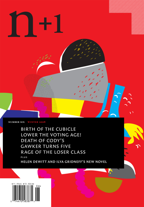
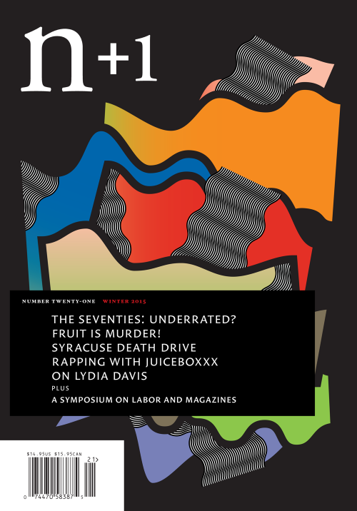
Browsing in a second hand bookshop the other day, I was struck by a wall decorated with the entirety of n+1’s issues. The covers of the New York-based literary magazine are beautiful and abstract, designed since the second issue by graphic designer Dan O. Williams. The covers are tantalising works of art, just as deserving of being framed and hung on the wall of a bookshop as being read. The art director of the magazine is artist Margaux Williamson from Canada, known for her dense and vibrant paintings, and so it is no surprise to hear that Dan takes more of a painterly approach to his graphic covers.
‘I feel like half my time in cover design is spent in the colour palette, patrolling the perimeter of the gamut,’ Dan tells me over email. ‘I like it best when the experience of the colours is either direct or ambiguous. A bit of optical flutter is usually a good thing. But I’d like to think that my final decisions come out of the compositions themselves, rather than from any individual’s personal preferences.’

Each issue’s cover isn’t necessarily derived from its content. Instead, it is an expression of a particular mood that Dan is feeling, or a reaction to an issue’s theme. Issue 21 (above) was themed ‘Throwback’, and the cover design emerged from Dan’s personal response to the word, which he associated with feminism. The connection isn’t initially clear, and Dan’s thought process is more intuitive and subconscious than overly thought-out or planned. ‘I’ve been interested in some of the women of early animation and computer art — artists like Lotte Reininger, Mary Ellen Bute, and, particularly Lillian Schwartz and Suzan Pitt. Suzan Pitt’s film Asparagus was probably my biggest influence on the direction. I also thought, perhaps feminism is the ultimate throwback.’

For Dan, approaching a new issue’s design is a mixture of abstraction and mathematical precision, and he’s drawn to geometry and patterns. ‘I’ve always especially liked the idea of tangrams, and in many ways my process starts as a stochastic tangram — with random shapes and colours combined and recombined until something in their structure starts to make sense,’ he explains. Often Dan will begin with an idea like ‘fabric and flags’ (issue 16, ‘Double Bind’, above) or ‘floods’ (issue 15, ‘Amnesty’, below) and see where the composition goes. ‘Usually it goes to failure. Pretty much every early idea is a bad one, but a way to get the pieces moving.’

This approach is organic and subconscious. Sometimes the random aspect of the design is a point of concern, raising doubt in Dan’s mind. ‘Is this message real? Is the n+1 aesthetic real? I worry that someone could develop a program that could create new n+1 covers algorithmically…’ Dan has tested whether putting other images behind the n+1 frame results in something that feels like an n+1 aesthetic. He’ll use pictures by artists that have inspired him, like Sol LeWitt or artist Rob Lowe, but he finds that the result never quite clicks – proving that there is a very real n+1 message, even though it isn’t necessarily tangible. ‘There’s something I like best in the n+1 aesthetic that’s unfinished, unhip, unclever, unprofound. I still can’t define it, but I always hope to recognize it when I see it.’

For the most recent spring issue, themed ‘Conviction’, Dan took a completely different approach. Inspired by newer publications, like literary magazine Nat. Brut, the geometric shapes on the cover (above) are more angular and less fluid than the compositions from the past.
Speaking with Dan, I realise that my quest to find an n+1 cover formula proved fruitless. Like a painting, they’re emotive, subconscious responses to an idea or mood, and they can’t be pinned down easily with words - an intriguing and enticing quality for a literary magazine. ‘I’ve now completed 20 issues with n+1 now,’ Dan ends by saying, ‘And every issue is a new mystery awaiting a solution.’
Interview by Madeleine Morley


