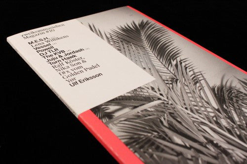
Out now: zweikommasieben #10

One of the toughest conundrums for the editorial designer is dealing with multiple languages in the same publication. Mainstream titles avoid this problem as they tend to be focussed on a single country; and while indies are more likely to be international in reach, they increasingly default to English as a get around. But most designers have at some point faced the bilingual challenge – how to present the same text twice on a page, when no two languages use the same number of words to tell identical stories. Swiss magazine zweikommasieben has the best answer I’ve seen for some time: let the difference in length between two languages (in this case English and German) become a design feature.

Helped by a tall, thin page format, the two languages each use a different font (one serif, one sans) and the balance between the two texts, pull quotes and headlines is the design. With the exception of the front cover the entire issue in monochrome, and with minimal visuals or photography, the visual conflict between the two texts provides the magazine’s identity. From a pure design point of view it is hugely satisfying, providing a strong visual identity through ruthless application of a simple idea.

The different text elements lock together tightly on the page without jeopardising readability. A tight grid provides stability to the layout, but there are no clear rules – column widths and text language switch place to create balanced pages from visual dissonance. The single consistent factor is the serif/sans rule.

Features open with luxurious space (above), offering relief from the busy pages that follow, and images are slotted into the tight jigsaw of the page layouts too (below).

As befits such a singular design vision, the subject of the magazine is a very specific niche: techno club and DJ culture. Yet we see no clubs or performances (the nearest we get is the exterior of a festival tent); the few photographs included are claustrophobic and non-celebrity in tone. This extends to a visual key to the contents list on the front cover, where four tiny thumbnail portraits of interviewees are linked to their names by number (below). The main cover image is a house plant.

zweikommasieben is an excellent example of honing design down to a single idea and pushing that one idea to an extreme. I can’t think of a better aesthetic approach for a magazine about German techno culture.
Editors: Patrick Alexander, Martina Lussi
Design: Simon Rüegg, Raphael Schoen & Kaj Lehmann
Review by Jeremy Leslie


