Designs of the Year 2013

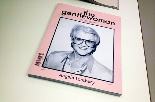
The London Design Museum’s annual ‘Designs of the Year’ exhibition launched this week. It’s the usual mix of architecture, fashion, digital, furniture, products, transport and graphics – seven categories mixed together, grouped by loose themes. To give an idea of the range involved, among the 99 exhibits are the Shard, a 3D printer, an annual report and a new material ideal for ketchup bottles. I nominated several pieces of editorial-related work from which one magazine got selected (congratulations to The Gentlewoman, the single magazine in the show, and to art director Veronica Ditting) as did Berg’s clever Little Printer.
The seven categories will be judged by jury and a winner found for each, from which an overall Design of the Year will be selected. So there will be a graphics winner, although it’s difficult to guess what might win as the category felt pretty weak at first look. Much as I love The Gentlewoman I don’t see it winning, and though it’s interesting to see the Occupy Times newspaper (designed by Tzortzis Rallis and Lazaros Kakoulidis) in the show I can’t see that winning either. Perhaps Visual Editions ‘Kapow!’ novel (designed by Studio Frith) might sneak it (below)?

A tricky category, with projects by some big design names that, simply, aren’t the the best examples of their work. On second thoughts, perhaps The Gentlewoman might win? That cover!

Digital is a more exciting category, with Berg’s Little Printer present and smilingly linking print and digital (above), but facing strong competition from the Gov.UK website (below).

Again we’re presented with extreme variety: Little Printer is a super-directional ‘what if…’ project, while the reinvention of all UK government websites as a single, well-designed, service that is a marked improvement on what went before. It’s not an immediate ‘wow’ but, as their custom display showed, it’s a piece of design that is being 24 hours a day by people across Britain. Quietly inspirational (designed by an inhouse design team led by Ben Terrett).

Another digital favourite at the launch was the Candle in the Wind light (above, by Moritz Waldemeyer for Ingo Maurer), a highly realistic LED recreation of a flickering candle flame; the image above doesn’t do it justice. Forget the previous generation of fake candle light bulbs, this is beautiful.

And here’s that ketchup bottle... (LiquiGlide by the Varanasi Research Group).
As ever, Designs of the Year is a slightly random but fascinating snapshot of the past year but well worth seeing. Forget about winners and enjoy the mix.
It’s at the Design Museum until July 7.
Other reviews:
Design Week
Dezeen
The Guardian
Creative Review


