

Econy
Our latest Podcast ended with a quick look back at Econy magazine. This publication was hugely influential in the late nineties, reinventing the business press and in particular highlighting a new generation of German photographers.
Econy had conflicting directions to its make-up. Editorially it sought to reflect the the de-formalisation of the business world, covering the new generation of businesses and business people that established the new norms we take for granted today – smaller teams, freelancers, casual wear, modern communications.

In less sensitive hands the design of the pages might have adopted the then vogueish anti-design approach of David Carson and Raygun; this would have sent a far clearer message of intent, perhaps created a bang at first, but then faded with a whimper.
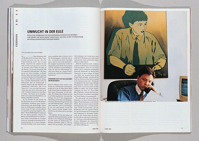
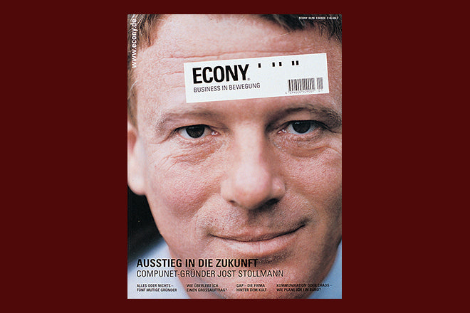
Instead, Mike Meiré was brought in to art direct, applying a structured, modernist approach that was both respectful of the content yet contemporary enough to mark clear space between the magazine and its more traditonal competitors. That solid structure used Univers throughout, generous white space, and a brilliant selection of new photographers. Their images were pieced together in bold, structured collages and make a fascinating record of the shift from suit-wearing to casual wear as well as of nineties office technology. The unstyled reality on show shares something of the later approach of Apartamento.

In my book ‘Issues’ (2000) I showed some examples from Econy, along with a brief text and interview with Mieré, which I reproduce below.
Econy (it’s a made-up word, but refers to economy) was set up in response to the standard, stuffy business magazines. These magazines ignored the new generation of business people, the new entrepreneurs that have set up businesses in fashion, music and media over the past five years. These people were different, unlike the previous generation of business people, so Econy was to be different too.
Art director Mike Meiré was clear that to merely have more relevant content was not enough. Such a new idea had to look new and be relevant to its media-aware target audience. ‘Econy came along at exactly the right time,’ he explains, ‘I had this idea for a very constructed layout. David Carson’s ideas, which I loved initially, had become very tired.’ So he designed the exact opposite – a very tight set of limitations, playing off black-and-white typography (Univers and Times) against colour photography. Meiré calls it a liquid identity – a very strong identity that has an inbuilt provision for change and development. ‘Sometimes now there are too many options. Limitations are good.’

The photographic element was key to making the magazine different to other business titles. ‘I spent six months looking at photographers’ books. I wanted to use the type of photography our audience know from music and fashion magazines to ensure they related to the new project.’ The resulting portraits feature business people as real people, in their busy studios and offices where people are rushing about, where there is lots of activity.

Still life photography is used too, a difference being established by avoiding the hackneyed lighting tricks so often used to try and make objects look ‘cool’. Instead all such material is shot as naturally as possible, with a knowing nod toward fashion where possible, such as the use of the ‘right’ fabric behind an object.
French art director Serge Ricco has also been sharing pages from Econy and its successor Brand Eins on his Instagram feed. Worth a look as Mike Meiré, who continues to oversee the art direction of Brand Eins, has added his own comments below the images.