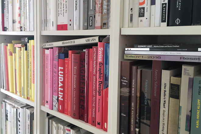
Esa Matinvesi, Art director
Esa Matinvesi is a freelance art director based in London, a graduate of Central Saint Martins and the Royal College of Art. He’s worked for Port Magazine, The Times, and The Sunday Times Magazine, and is currently balancing his own studio projects with providing associate art direction for Brave New World’s editorial commissions.

Today, we asked Esa to show us some of the magazines informing his work as an art director. We asked him to pick three issues from his personal collection of publications: an old issue, a new issue and another thing...
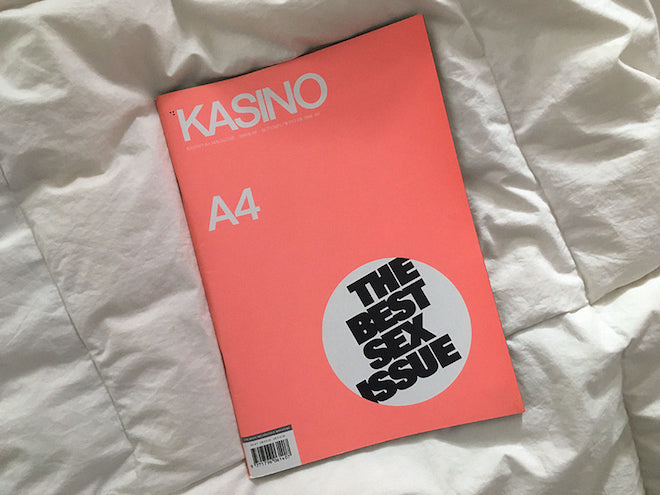
 An old issue: Kasino A4 #8
To me one of the pioneers to kick off this current indie mag boom has been Kasino A4. Despite claiming to be the most melancholic title out there, the magazine really reflected the free spirit of its creators. It wasn’t unheard of that a photoshoot would be executed after a few rounds at the local pub, for example.
Kasino is one of the best designed magazines I’ve ever come across. The art dictation, including its paper choices and its use of colour, is something we can all learn from. I also admire the fact that the magazine closed on purpose after ten issues – at a time when it was still on top. Always leave them wanting more!
 A new issue: Fantastic Man #24
I'm waiting to get my hands on the new 032c from Berlin, but as that hasn’t arrived to London yet, I will choose this latest issue of Fantastic Man.
Even within the standard excellence the magazine delivers I really think this limited edition cover of fashion designer Demna Gvasalia (shot by Inez & Vinoodh) stands out. It’s just so stunning in its simplicity. No marketing lead eye contact, no shouting cover lines – I just wish we could see this kind of boldness more often among the regular newsstand titles.
With its insightful interview with AA Gill and the humorous construction yard fashion shoot starring Jack Self, the inside of the magazine doesn’t disappoint either.
 And another thing...: Radical Philosophy
While visiting London’s various museum shops, Radical Philosophy always strikes to me as one of the most standout publications. The magazine is designed by its editor's professor, Peter Osborne. Despite formally not being a designer, Osborne’s understanding of his content and his total control over it has resulted in an incredible set of issues.
The magazine is currently on its 200th issue and is going through a high gloss cover phase. I’ve been lucky enough to get my hands on some of the old copies from the 70s and 80s, which, with all their oddities, are full of incredible reference points. To me, some of these layouts could be taken out of today’s ZEITmagazin, and that cover could come straight out of Werkplaats Typografie.


