Fantastic Man #31
I wrote about the reinvention of Fantastic Man last issue, noting about its new format, ‘I love the square. The extra width helps the design, it’s a shame more mags don’t try it.’
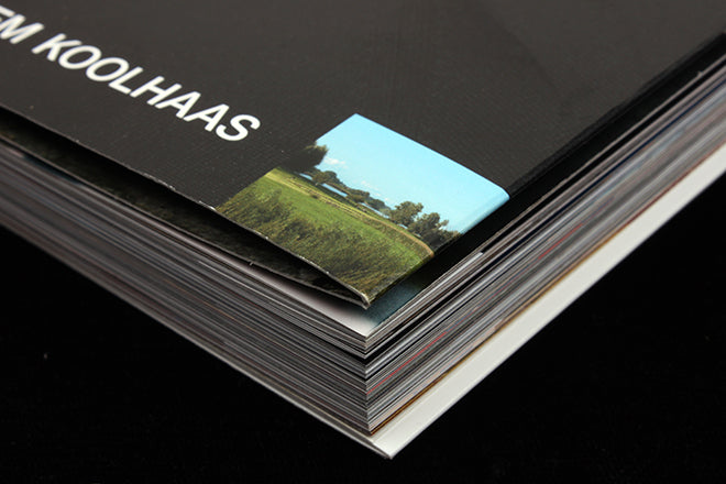
The second issue in the redesigned format – another very strong edition, this time centred around architect Rem Koolhaas and his love for the countryside – recently arrived. And it’s a tiny design detail I want to focus on this time.

While the new issue largely continues the same general design direction, an addition is a focus on the corners of the pages. Here, small squares echo the overall page shape, knocked out of imagery with an enlarged page number (above) or indented into text columns (below).


On one occasion the square and page number even knock out part of a headline (above).
The same size square appears on the front cover, containing a tiny generic ‘countryside’ image to highlight the issue’s theme (top and below). The square appears randomly throughout the issue, just enough times to be noticed but not so many that it becomes an irritation. It’s a subtle addition to the new format; I find it enormously satisfying.


Yet even as the creative team set up this device, they break it. Also appearing at the corners are a series of triangular interventions containing bright typographic designs that appear to be from tourist organisations related to the areas mentioned on the pages (above, below).

These little details are the print version of digital easter eggs, small surprises that will be completely overlooked by some readers but are a delightful extra for those who do spot them. It’s little touches like these that highlight the joy the team have in making magazines.
Editor-in-chief: Gert Jonkers
Editor & Creative director: Jop van Bennekom
Senior designer: Merel van den Berg
Designer: Roel Nabuurs


