

FAT 2015
A general assumption about magazines is that the bigger, thicker, heavier an issue, the better it is. It’s what we all default to – more pages, heavier paper. This view is particularly prevalent among indies – that added weight emphasises the physical object, adding preciousness and collectability. The third issue of Finnish art title FAT proves this to be a false generalisation.

The 2013 and 2014 issues of FAT were heavy, perfect bound publications. Published and designed by the Kasino team in Helsinki, they were lauded here for their visual and verbal wit (see our review of the 2013 issue). Yet the latest issue has left that heft behind, and is instead a lightweight flick, more like a newspaper supplement or news weekly than an art book. And guess what? The magazine is better for it.

As the images here show, the general approach is the same as previous issues. The editorial identity remains off-the-wall, the chatty intro and outros positioning the magazine as a provocative observer of the Finnish art scene.

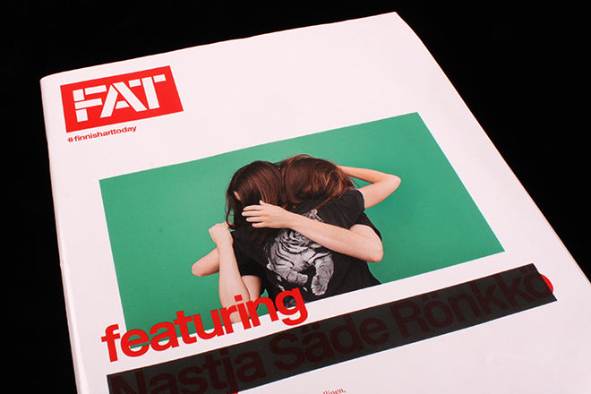
The design details are satisfyingly anarchic, as on the cover feature about Nastja Sade Ronkko (above) and her desire for privacy (she’s on the cover too, her name printed in red but obliterated by a black box).


Page by page the visual anarchy continues. And rather than disappointing, the cheap shine of the paper adds to the general mood and improves the magazine experience.

Light catches the dark areas, and printed matter from the other sides of the pages shows through randomly (above), something usually to be avoided. The noisy page-turning, general flimsiness and the way the pages sit open works really well.
It’s the perfect reminder that paper and binding should be chosen for the project in hand, not with pre-selected assumptions in mind.
Editor: Tero Kartastenpaa
Art dictator: Pekka Toivonen