

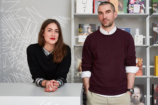
HelloMe, design studio
This morning we’re in Berlin visiting HelloMe, the impactful, eye-catching design studio with a typographic-led approach that it applies to projects for art and culture based international clients (you’ll know its striking, minimal look well if you’re a fan of Warp Records or if you’ve ever spent any time at the Berlin Art Prize).
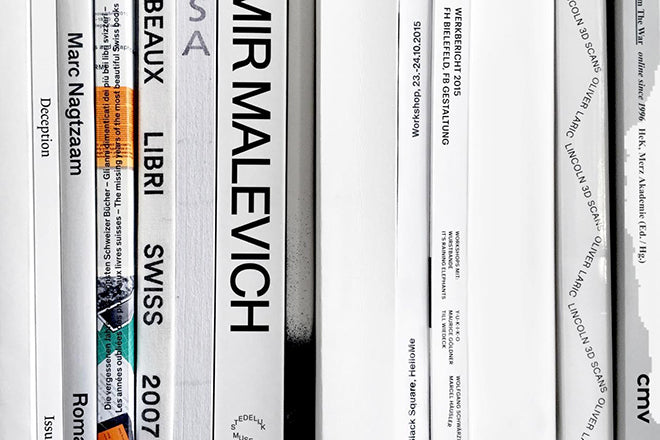
We caught up with founder Till Wiedeck and his team to find out which magazines were regularly influencing and inspiring the studio. For this week’s instalment of Issues, HelloMe picked three magazines for us: a new issue, an old issue, and a detail that it finds especially intriguing.

A new issue: Pin-Up, Berlin Special, issue 12, Spring/ Summer 2012
– selected by Martin, designer at HelloMe
Pin-Up beautifully demonstrates how far you can push a design, even when using only one typeface – Arial. After many years Pin-Up still surprises us with each of their playful and intelligent issues.
Content-wise this issue is one of our favourites for the simple fact that it’s all about our beloved city – Berlin. It features some great minds and architects, like Arno Brandlhuber and Jürgen Mayer H.

An old issue: Werk, Issue 8, August 1959
– selected by Joel, designer at HelloMe
The content of this issue is the main reason it made it into our selection. This particular issue focuses on the architecture and art of Protestant Churches. It features great photography of some of the most beautiful churches built at the time. These photos sit next to architectural drawings, floor plans and models. The double page spreads and layout of images powerfully suggests the scale and level of detail in each building. The multiple, subtle changes in paper stocks is a nice feature, and lastly the cover is a classic example of Swiss graphic design.
And another thing: Salvador Dali, Staatliche Kunsthalle Baden-Baden, 1971
– selected by Till, founder and creative director of HelloMe
Here’s a very well designed magazine/monograph about Salvador Dali published in the early 1970s on the occasion of a solo exhibition at Staatliche Kunsthalle Baden-Baden.
We love the two-tone screen-printed cover on grey stock, especially the clock detail in the eye. It features great texts on Salvador Dali and his work. This is combined with flawless typesetting on the inside, and then further complimented by black/white, two-tone and coloured imagery.