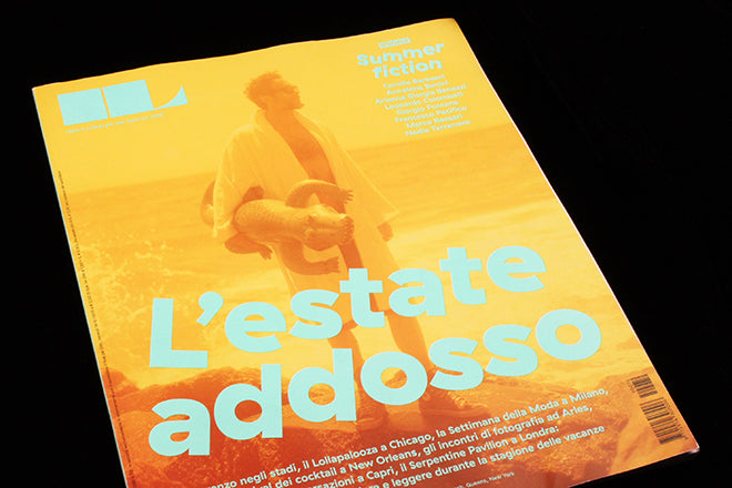
IL summer issue
IL, the monthly supplement to the Italian newspaper Sole 24 ORE, is a difficult magazine to track down outside its home country so it was exciting to open a parcel at magCulture HQ recently and have a bundle of recent issues spill out.
The magazine is best-known for its extraordinary infographics and the typographic wizardry of the ‘Rane’ section at the back of each issue; art director Francesco Franchi has been at the forefront of the growing interest in infographics, and leading the small IL design team has set a new benchmark in newspaper magazines (you can see a selection of the black and white, gothic ‘Rane’ designs on designer Francesco Mutti’s flickr site).
The current edition of the magazine is a summer special; from the front cover onward it is very different to the regular issues. The cover (above) has an artfully bleached-out image announcing ‘summer of me’; it cleverly captures the analogue burnout of overexposed beach photography, an effect repeated for the opening page of the summer fiction section (below) inside the issue.
 Franchi and his team have a wonderfully confident way with type, as shown in the headlines across these images. Tilting each individual character like this is something almost every designer has played with at some point; few see it through to the printed finish.
 The design team clearly have fun with all elements of the magazine, but for this issue they seem to have been allowed to take everything a little further than usual.
 The tilted headlines feature regularly, with typography blending strongly with the photography and illustration. This book review applies the bleached photographic colours to the book cover reproductions (above).
 This section opener (the regular ‘You Only Live Once’) is a parody of a celebrity magazine page, a messed up collage of cut-out figures.
 A summer festival guide overlays blob-shaped images over more over-exposed beach scenes (above).
The overall effect is wonderful; any issue of IL is worth a look but this is a particularly special one. The pages are full of character, each one busy and complicated, yet none of the elements feel gratuitious or unneccesary. A very special edition of a great magazine.
Editor: Christian Rocca
Art director: Francesco Franchi
Designers: Micaela Bonetti and Madda Paternoster
Photo editor: Raffaele Vertaldi
ilsole24ore.com/cultura/il-magazine.shtml


