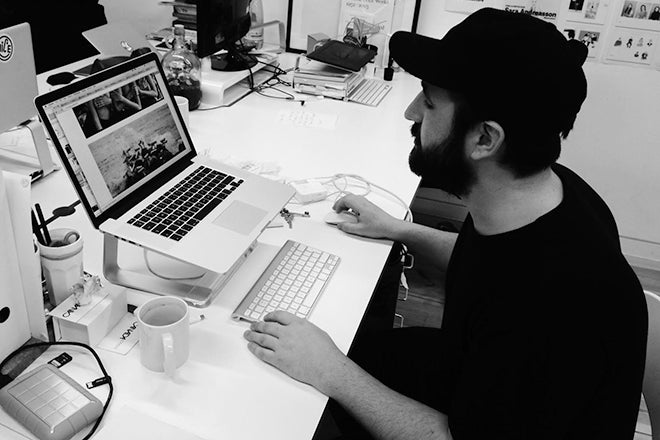
Jamie McIntyre, Printed Pages
We’re starting the week off with It’s Nice That art director Jamie McIntyre, one of they key players behind the new look of Printed Pages. We’ve covered the magazine twice before for our At Work With feature, and the fact that we’re speaking with them a third time is a testament to how dramatically and frequently the magazine changes. The latest issue has seen a return to the original It’s Nice That magazine’s ‘best of the web’ approach.
Where are you today?
It’s Nice That HQ in Hagerstown.
What can you see from the window?
The canal and some poor trees that look like they are about to be uprooted in this stormy weather.
Are you a morning or evening person?
Evening.

Which magazine do you first remember?
Style Magazine that came with The Sunday Times. I used to want to study Fashion before I got into Graphic Design. Reading Colin McDowell’s fashion column after a hard day on the rugby pitch… that was my usual Sunday from around 15-18 years old.

What’s your favourite magazine this morning?
We just got the new Mousse in the studio the other day. There I discovered the artist Mernet Larsen who blew my mind.

What’s your favourite It’s Nice That post from last week?
My good pal Jane Stockdale has been documenting the Olympic athletes of Kosovo in their lead up to Rio 2016. It is their first ever Olympic games next year. Such a great story and beautiful snaps as always from Jane.

Printed Pages notoriously redefines itself every year or two. You’ve now decided to go back to your original ‘best of the web’ approach, publishing your favourite articles from the It’s Nice That site in the magazine. Why the return?
Digital first, digital everything is the real focus of It’s Nice That since we launched the new site back in the summer. It is a real step on for us as work, exclusive ffeatures and news now form the backbone of itsnicethat.com.
Our online audience is growing and growing at just under half a million a month, so our time, budgets, writing and commissioning is naturally best spent crafting content for the site first and foremost.

A magazine and a website are always going to be very different tools of communication, so we are really excited to have moved back to this format and see our content take on a completely new lease of life in print.
 How did you approach the design for the new editorial direction?
Bringing the design back in-house for the first time in a long time was really exciting. I worked closely with Alistair Hanson (designer) and Will Hudson (acting editor-in-chief) to help craft our approach for Autumn/Winter 2015.
 As we increased the pagination to a much bigger beast, we were keen to grow the design in confidence also. Celebrating strong, rich imagery rather than tucking it away, larger headlines, and Ali selected some really considered typefaces to sit proudly alongside and compliment our content, but never overwhelm. The content for us will always determine the design—whether we play, whether we shout, whether we sit back and simply welcome the reader in quietly. It is has been a really exciting evolution for us and we are already chomping at the bit to get stuck in to Spring/Summer 2016.
 Tell me about the Erik Yahnker cover. Why did the Kanye image feel relevant to the new approach?
Our intention since Spring Summer 2015 with Tadao Cern’s sunbathers is to put our tone of voice slap bang on the cover and to get people to familiarise with Printed Pages as a magazine. The cover for us should be inspiring, engaging, human and light-hearted. We don’t take ourselves too seriously which I hope comes across.
When defining these values in-house, Eric instantly came to mind. I started a dialogue with him on email and off we went!
What are you most looking forward to this week?
A wee trip to Glasgow on Thursday to see the folks.
What are you least looking forward to this week?
Trying to do 5 days work in 3.
What will you be doing after this chat?
Time sheets <3
itsnicethat.com/features/printed-pages-aw15


