Javier Errea, Malofiej Awards and World Summit
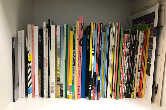
Next week the Malofiej Infographics Summit, the SND’s annual celebration of visual journalism, takes place in Pamplona, Spain. One of the organisers is editorial designer Javier Errea, who shares some favourites from his magazine collection ahead of the week of lectures, events and awards.

We asked Javier to take us through some of his favourite publications that use infographics frequently as part of their identity.

A new issue: Eight by Eight
Launched in 2014, Eight by Eight is a quarterly miracle about football based in NY. I discovered it by issue three, and was overwhelmed by its illustrations and graphics; it’s undoubtedly the most impressive publication about soccer I know of. Every issue is a new surprise. Soccer information is routine in the media, but Eight by Eight presents it intelligently, surprisingly and with impact.

In terms of graphics, you can easily recognize John Grimwade’s touch. He start working with Peter Sulivan at the London Times during the 70s, then became art director at Conde Nast publications, and now teaches at the University of Ohio.

An old issue: Mundo Estranho
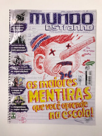
A Brazilian monthly that is specifically for teenagers, Mundo Estranho is a small and successful publication that launched in 2006. It’s owned by Grupo Abril, one of the biggest publishing companies in the country. It shows that young print readers still exist if you know how to present the news and other topics to them properly.


It wins awards at Malofiej every year for its beautiful combination of illustration, graphics, comics and other visuals. Current news and affairs are explained in a simple way, but are also attractive and comprehensive. It’s not just a silly kid’s monthly; I often go back and look at issues of this from as early as 2009.

And Another Thing: The Shelf Journal
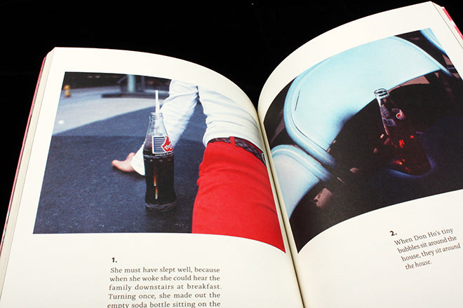
I first bumped into The Shelf Journal by chance during an Easter trip to Amsterdam with my family in 2014. I was immediately captivated by its cover (issue three) as well as its focus: publishing design and the cult of the shelf. Written in both English and French, I love the way it displays books and magazines in the pages, but also the mini-graphics that go along with each shelf that gets presented.


It’s one of the most simple and effective examples I know of showing and explaining size, which can be one of the biggest challenges for graphic artists.


