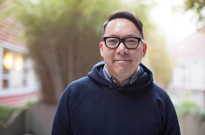
Leo Jung, California Sunday Magazine
The California Sunday Magazine is a monthly magazine that is published independently and distributed as a Sunday supplement to several California newspapers. This unique publishing model is typical of the company behind the magazine, who also conceived the live Pop Up Magazine. We spoke to creative director Leo Jung about both projects.

Where are you today?
At the California Sunday office in San Francisco.

What can you see from the window?
Are you a morning or evening person?
Neither. Getting out of bed requires at least three snooze buttons. Once my eyes get heavy in the evening I’m completely useless creatively. Is there such a thing as a midday person?

What was the first magazine you remember enjoying?
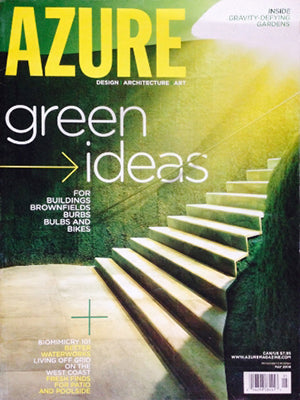
Azure, a Toronto-based magazine on art, architecture, and design. As an aspiring young designer, I remember admiring how lyrical, smart, and simple the design was (and still is). I ended up working at Concrete, the design studio responsible for its beautiful art direction at the time. And as fate would have it, I became one of the two designers to work on the magazine. That was my first toe dip into editorial design and I’ve loved it ever since.

What’s your favourite magazine this morning?
Big fan of the usual suspects (New York Times Magazine, New York, Wired) but you should check out Prefix Photo a magazine about contemporary photography. My friends at Underline Studio in Toronto have designed it for years now but they’ve always done a top notch job, aside from their other brilliant work.
 The California Sunday Magazine has a very calm approach to typography and design. Describe your influences.
Having had the distinct pleasure of working at The New York Times Magazine and Wired, two magazines that are incredibly smart but couldn’t be more different in terms of design, it was useful to draw upon those two experiences. The California Sunday Magazine offered an opportunity to develop a design, an identity, and a voice that was all its own. What’s never changed wherever I’ve worked is the approach. The design, photography, and typography are all in service to reflect the tone, mood, and subject matter of the story. That said, the visual elements, can be quiet, loud, serious, funny — it’s whatever is appropriate. I admit that I naturally fall on the more minimal approach to design. I am always more drawn to solutions that are simple but (more importantly) surprising.

Finding the right typeface was a challenge. California is a special and unique place; the landscape, the sky, the way the sunlight hits everything is unlike any place I’ve ever seen. It has a personality all its own. And as Douglas McGray, my editor, has said, it’s more than a place. It represents a set of ideas and values; a look and feel. For those reasons, it was especially important for us to not feel or look like New York. That city is arguably the epicenter of design and naturally, the inspiration for many designers to draw from. It’s bold, it’s sharp, it’s unapologetically confident.

California is different. In a good way. We’re all of those things too but we’ve got palm trees instead of skyscrapers. I think that small detail alone affects your general outlook and demeanour. That said, I wanted a typeface that would embody all of that. Trends were showing a lot of use of condensed sans and high contrast serifs the last few years, so I was determined to find a principal typeface that was the complete opposite: a rounded slab serif. I also wanted to make sure there was enough of a visual contrast between the typeface and our beautiful, italic logo (designed by Jessica Hische).


When I saw Foro Rounded designed by Hoftype for the first time, I instantly fell in love with the letterforms. It was sophisticated without being fancy and casual without feeling hippy. In other words, Californian. So much attention was given to the weights and ligatures, it was clear it would be a versatile face for a title that would cover a wide range of topics. Coincidentally, it ended up pairing nicely with Equip (my sans) and Sina Nova (my body text), also created by Hoftype.
How far ahead do you work on stories for each issue?
We’re a brand new magazine so we have just enough folks to put out a magazine each month. At the moment, there’s no “ahead,” there’s only “now.” So long as more and more readers enjoy and support what we’re doing, we’ll get bigger and even better at what we do. In other words, it happens fast. Really fast.
 Tell us about the Pop Up Magazine you also produce.
Before California Sunday, there was Pop-Up Magazine; an experiment in bringing together writers, radio producers, artists, musicians, and photographers to tell interesting, unpublished stories live on stage. It’s put together by a small and incredibly hardworking team: Pat Walters, Douglas McGray, Derek Fagerstrom, Lauren Smith, and Haley Howle. It’s been phenomenally successful here in San Francisco, selling out 2500-seat theaters in minutes.
With the print, digital, and live magazine, we pride ourselves on being able to tell great stories in any possible format. Earlier this year, we were invited to do a special curated session at TED. Currently, we have a new show in the works called Sidebar. Tickets are on sale tomorrow (7 July) at noon! (Sidebar logo by Erik Marinovich).
What are you most looking forward to this week?
Friday. Not only because it’s the end of the week, but also because it’s our final day of ship.
What are you least looking forward to this week?
The late nights that are needed to hit that Friday deadline. On second thought, I’m most looking forward to sleeping in with my wife Jen on Saturday. And maybe a chocolate pretzel croissant.
What will you be doing after this chat?
That chocolate pretzel croissant sounds pretty good right now actually.


