MacGuffin #1
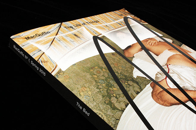
The editorial letter of the first issue of MacGuffin features two pixelated pillows on either side of the page (below), a motif repeated from the front cover. The text is the duvet, and the paper stock is thin and slightly transparent, similar to a hotel bed sheet. Like a Hitchcockian ‘MacGuffin’, the magazine isn’t interested in things that are iconic, but rather in the mysterious, unexpected things that set a story in motion – and so for their first issue, as the editorial letter visually suggests, the publication focuses on beds.

At design fairs, the ratio of beds to chairs is 1:500, although the former is an object we spend a third of our lives on. Reading the magazine, which is packed with so much imagination, insight and genuine experimentation, it’s hard to believe that no one has (yet) created an Apartamento-style magazine focused purely on interviewing people alongside photographs of their beds. Editorial teams seem to like desks, living rooms, kitchen cupboards and chairs, but beds are almost too personal and sacred.
Each issue of MacGuffin will look at a different unassuming yet potent ‘thing’, an idea a bit like London-based Dirty Furniture, which has a similar anti-showroom ideology. It’s distinctly different, though, as the Dutch magazine is executed with a whimsical European sensibility, frequently alluding to Francois Truffaut and early twentieth century theorists like Sigfried Giedion. The magazine’s strangely dreamy yet academic rigor is matched with soft yet crisp design, and with a fold-out cover that features Juergen Teller’s self-portrait with Charlotte Rampling on a hotel bed in Paris, what’s not to like?


The beginning ‘chapter’ (designated by a red title page – above) is not specifically bed related. Sam Jacobs writes about the intangible in design – quoting David Foster Wallace and Kafka and engaging with objects in way that combines art criticism with new journalism (also above). A feature on Nest – a short-lived luxury interiors magazine that was a cacophony of visual excess and unrestrained production – includes all 26 covers laid out gloriously on the pages (below). Old spreads have also been included (also below), and a change to a glossy paper-stock makes it feel like you’ve actually holding a copy of the iconic interiors magazine rather than MacGuffin.


Bed-time stories, or stories relating in some way to beds, have been beautifully laid out on white rectangles (pillows?) against an alarming red background, with illustrations by Kate van Harreveld (above). A flashing red comic of beds by Koen Tasekaar continues the scratchy, lo-fi illustrative style (below), and a comic carved into a bed in Iceland similarly departs from conventionally clean aesthetic associated with design magazines (also below).


The paper stock returns to a glossy format for the image-based section of the magazine. These visual features are both imaginative and impeccably researched: examples of patented bed designs from the draws of the United States Patent and Trademark office (above) – like a self-making bed and a refrigerated bed – are brilliantly Gilliam-esque, and a spread on bird beds – or nests – is beautifully executed (below). The text-based sections are grainier, almost like tracing paper, and there is something very studious about the texture, which suits the meticulousness of the writing. The whimsy of the tone is visually alluded to by the use red or blue type, or baby pink paper (also below).


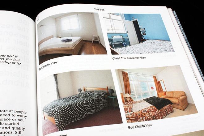
A spread called ‘Sweet Dreams’ artfully shapes cakes to look like mattresses (above), a feature on bedrooms with views onto famous tourist attractions like the Brandenburg Gate and Big Ben is somehow quite touching (below), and a selection of paintings by Madelon Vriesendorp (also below) is blissfully surreal.


MacGuffin is a magazine that subverts and challenges the airbnb-ification of everyday life, where furniture is prized for looking stylish but where objects like beds have a lost all sense of character, and any sense of the individual who sleeps and dreams there. The magazine’s team is dedicated wholeheartedly to pursuing their ‘MacGuffin’, and to following it to whatever unusual lengths and bizarre corners it might take them to.
Editors: Kirsten Algera and Ernst van der Hoeven
Design: Sandra Kassenaar

Buy your copy of MacGuffin from the magCulture shop now.


