Magazine of the week #2: 8 magazine
8 is a quarterly magazine about photo-journalism that has published some remarkable photographic stories. I've been aware of it for several years but felt that until recently the magazine didn't have the design to make the most of its content and thus relevant to this forum. The design problem started with its name – for some time it struggled with a logo that clumsily replaced the G in EIGHT with a figure 8 (Ei8ht). Then a couple of years ago the magazine was redesigned by Phil Evans and Rob Kester, both of whom have full time jobs (at BBSaunders and Carbon Design respectively) and design the magazine in their spare time.
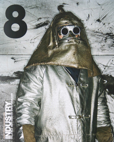
The new 8 logo, in Helvetica, is representative of a new no-nonsense minimalist approach to the design (the name is still referred to as Ei8ht when used in text but at that size it appears less clumsy). The pages are quite rightly ruled by the photographs, the design gently ticking in the background. A simple set of rules and techniques underpin the design. One font, a medium weight of Helvetica, is used throughout. Pictures appear against either a white or black background (the low print-run – 5000 – means the black really IS black). Each issue uses a third colour for detailing in headlines and text, otherwise the only colour is that in the photography.
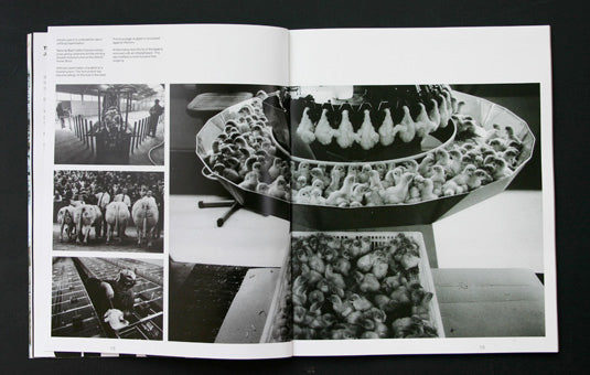
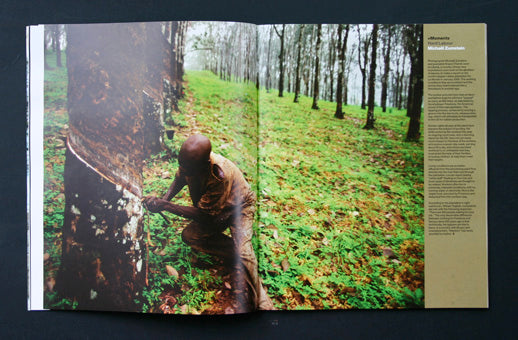
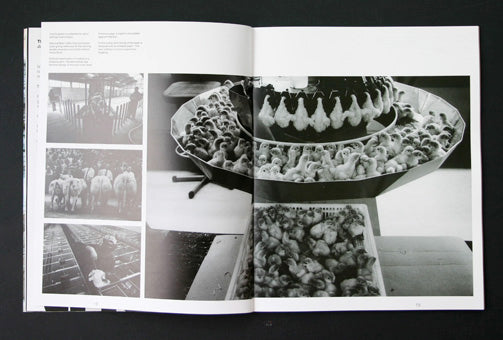
As well as traditional photo-journalism 8 often includes studio-based portraiture work and landscape images. Editor (and photographer) Jon Levy explains the criteria for selection as being 'the use of photography to effectively create a narrative, story-telling both visually and literally'. Recent stories have included reportage of London's Grime music scene by Ewen Spencer, a shocking series of portraits of Indian acid attack victims by Andrew Testa, and a set of images of Parisians sleeping in parks, by Stephan Zaubitzer.
The magazine now features more written content, with the addition of regular columns from name writers such as John Vidal and Tim Minogue and new fiction from writers such as James Meek. This additional written content has helped the design develop a visual character for the magazine.
Histories of photojournalism tell us that it has been killed off by TV. The classic magazines of the genre, Picture Post and Life are long gone and recent attempts to revive the form, such as Reportage, have stuttered and failed.
8 has succeeded because it is part of a bigger project. We magazine fanatics see only the printed edition but for its primary audience, photographers, the printed magazine sits alongside a large online presence. Indeed, the magazine started in 1998 as a website, foto8.com, three years before the first printed edition was published. Since then website has expanded to include an online bookshop, additional content, and subscribers areas. There is also a gallery at their office where they have now held several exhibitions.
I've wanted to feature 8 here for a while now. There's no particular reason to do so this week other than the fact its a project that has been quietly growing and developing – sales are increasing by about 10% per issue – and its deserves attention.
The spreads below give a flavour of the magazine.