Lost #1

Our latest Magazine of the Week is a special one for several reasons. First, it highlights print over digital; second it’s a travel magazine with a difference; and third and most importantly, it’s a rare example of a magazine from China.

Increasingly, our first sight of a new magazine here at magCulture is as a PDF. That was the case a few weeks back when I first saw Lost. The 320 pages looked flat and rudimentary, and despite some great colour imagery it had no immediate excitement for me. Later, when the printed edition arrived I was astonished; the same pages looked completely different, alive.
We write regularly here about the continuing relevance of print, how it has a role alongside digital, even as we highlight the great digital projects out there. But this simple change of medium from screen PDF to live magazine can’t be emphasised enough. Scrolling through 160 spreads of content designed in a starkly simple manner was dull, repetitive work that left me devaluing the material I was looking at.
Seeing it presented on paper was entirely different; yes, the lightweight matt paper stock was satisfyingly tactile, and the open binding allowed the pages to open fully despite the extent and physical depth of the volume. And that same open binding is always a hugely satisfying visual effect, revealing the production process. Opening the magazine for the first time you get that waft of chemical ink, the density of ink soaked into the matt pages adding to the sensory overload providing the print version of the money shot.

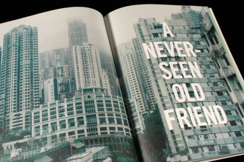
More than that, though, Lost demonstrates the efficiency of bound pages as a technique for dripfeeding content piece by piece. There are a lot of pages here, and as the design in these images shows they are starkly designed with multiple full bleed photographs. In PDF format the spreads get very repetitive, while seen one by one they flow in a carefully paced series of highs and lows, the bilingual texts quietly providing detail without interupting too harshly. The apparently simple design looks clumsy as a PDF; in print it looks polished and deliberate.

Editor/founder Nelson Ng is Singaporean, and has spent a few years in New York. Currently based in Shanghai, he launched Lost to promote the idea of travel as self discovery; this is absolutely not a travel magazine about Scandinavian city breaks and Australian coffee culture. The name Lost is a great name for such a magazine – the idea that travel is a state of mind is not new but this level of dedication to throwing oneself into the unknown takes the idea further than most. It tells the stories of 14 travellers who have immersed themselves in uncomfortable destinations so they will learn about themselves from their responses.


This brings us to the third reason we selected Lost this week. As a Chinese magazine (though presented in a mix of Chinese, English and bilingual text) the concept of uncomfortable is different to that of, say, an American magazine. China is belatedly discovering travel, as new freedoms and new money suddenly open up the world.

One writer records his 2012 train trip from Guangdong in China to Vietnam, a ten day experience recorded in words and image (above) that ended with a flight straight back to China.

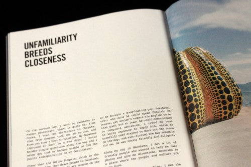
A trip to Japan (a destination chosen because writer Crystal Wong finds visiting places where he can’t speak the language the ideal break from day-to-day stress) is described in high detail, and takes advantage of the flickable pages with this image split between two spreads.

Alongside all the photography, the magazine is full of the detritus of travel. Boarding passes, screen maps, airplane windows all feature, along with grabbed pictures of meals and food.

A favourite story of mine is Richard Summers’ tale of picking up random pieces of rubbish on his travels, which led him to collect discarded/lost pictures of people. He subsequently used the pictures to search for the people they feature, the resulting Google pages revealing much about the basic characteristics the search algorithms use. Using an image found in Hong Kong really confused the search engine, presumably because of its limitations there, and a torn image with half a woman’s face results in a bizarre set of underwear models.
Even as I’m writing this review I’m discovering new stories and images I hadn’t spotted yet. It’s that type of magazine, to be dipped in and out of.
Whether created for the printed page or digital screen, a good magazine needs to marry content and form, and Lost does just that. It’s a great first issue.
Review by Jeremy Leslie
We have a limited number of copies of Lost available for pre-order in our online shop. We expect copies to be shipped from the UK around 15 April.


