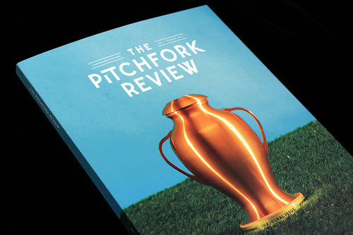
Magazine of the week: The Pitchfork Review

One very distinct genre of new magazine is the website/blog print spin-off. Various smaller blogs – including this one – have experimented with print, while others have made significant inroads into regular publishing (It’s Nice That, Freund von Freunden, Slanted etc). This new example is particularly interesting, as the apparent death of the music magazine has been, in part, blamed on the rise of online music coverage. And when people talk about online music writing they generally mean Pitchfork, a site that’s been reviewing music online for 17 years now.

The Pitchfork Review arrives as a heavyweight music journal – this is defiantly not a zine or an old fashioned music weekly. Perfect-bound, on matt paper at a cut-down A4 format it’s pitched at the independent magazine scene and promises a selection of their best content from the last four months. ‘We wanted an opportunity to give some pieces a second life, one that won’t be lost to Google searches and Twitter archives,’ explains the introduction note (and see the subscription ad above).

The issue acknowledges the irony of its existence, opening with a piece by Simon Reynolds (author of the excellent Retromania: Pop Culture's Addiction to Its Own Past) that takes a nostalgic look back at the UK music weeklies I grew up with, the very magazines largely rendered obsolete by the digitalisation of music and music journalism.

It then moves though a variety of types of content; there’s more nostalgia in a piece about jukeboxes (above), which had me wondering whether it was intended as a celebration of this quaint part of pop history or as an explanation to younger readers of references in older songs!

Much of the writing is lengthy and presented in a very serious manner, footnotes and all.

But there’s also plenty of space for photography – there’s a whole section devoted to previously unseen shots from Pitchfork’s first music festival, held in Paris in 2011 (photographs by Nabil).

Ans there’s a lot of original illustration, both alongside written stories (above) and in the form of standalone comic stories (below).

The back section is the most interesting looking part of the issue, with briefer (but still quite long) essays presented on a different paper stock and with a more lively editorial design sensibility (above).
The Pitchfork Review is a very smart new magazine, an exciting launch that promises much. I first found magazines via music, so it’s great to see a new combination of those two forms making such a splash. I’m not sure whether the editorial team – they seem to be the same people as edit the website – have identified a unique angle on their subject but there’s no reason to think they won’t get there in a few issues.
Meanwhile, it’s satisfying to find a project that confounds the assumption that music magazines can’t work.


