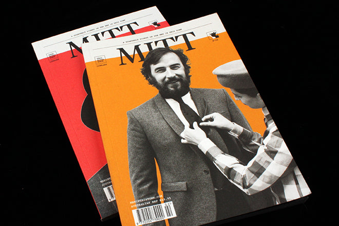
MITT #2
Part diary, part ’zine and part fashion field-guide, Mitt is the magazine version of Australian street-style blog ‘Men in this Town’. Covering men’s style from around the world, the publication meets with fashionable locals in the likes of New York, Sydney and Osaka and talks to them about the clothes that they wear and what they love about where they live. It’s the type of magazine that translates and extends the spirit of its blog into a printed format, re-fashioning and fleshing out its online vision to suit a long-form and in-depth medium.
 The publication’s small notebook size and inclusion of a margin on each page contributes to the field-guide/ scrapbook feel (above), and a colour palette of mustard yellow and primary red, blue and green creates both subtle cohesion but also eye-catching variety (below).


 In the ‘Meet’ section, a feature that is half-Instagram feed and half travel log follows musician David Jones II around New Orleans for a week, documenting his daily routines (above). A conversation with the first The New Yorker creative director Wyatt Mitchell (who has since left to join Apple) is a must-read for magCulture readers (below), a whimsical interview that takes place in the Vanity Fair cafeteria and explores Wyatt’s distinctive taste for three-piece tweed suits and double denim.

 A change in paper stock designates a change in pace. The magazine switches from a sturdy matte to a slippery glossy for a street-style spread (above), a fast-pace section featuring images from the ‘Men in this Town’ blog. A return to matte designates a return to long-form: the magazine subtly and cleverly uses these differing textures to evoke and guide our reading experience.
There are currently many independent men’s style magazines about. Mitt stands out because of its bold aesthetic: its design has distinctive style but is still simple and unfussy enough to be able to convey the captivating personal style of its interviewees.


