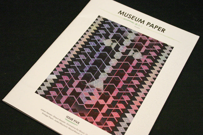
Museum Paper, Sede, Ein Magazine uber Orte
These are three lovely small magazines I've received over the past few months and been meaning to write about.
Museum Paper is published twice a year by Stockholm design studio Museum Studio.
Every issue is a collection of work by invited artists, each one getting space to show work alongside a brief interview. It successfully combines the energy of an art fanzine with the higher production values of more traditional publishing.
In a sense it’s unremarkable, but the care given to the choice of featured artists (an international selection of photographers, illustrators and fine artists) and the presentation (thick matt stock) makes Museum Paper a special project.
Sede is published from Buenos Aires, Argentina, and comes in a tiny prefect-bound 12x18cm format. Like Museum Paper it’s a combination of artwork and written interview. The texts are in Spanish but there’s an English translation supplied as an insert.
Text and image are kept separate and the design is very plain, but Sede is another deceptively simple publication that is doing something worthwhile. Judging by some of the content – interviews with the likes of Gert Jonkers from Fantastic Man and Kai von Rabenau from Mono.Kultur for instance – publisher/editor Juan Ignacio Moralejo knows his magazines. I don’t see many Argentinian magazines, but this makes me want to see more.
Ein Magazine uber Orte – A Magazine About places – is published from Berlin by a couple of photographers and a designer. Each issue is about a single place, that’s place in the widest sense. Issues to date have been themed on Alexanderplatz, Desk (shown here), Park and Kitchen (next up is Crime Scene).
This is another carefully curated combination of texts and images, the theme helping provide more coherence than Sede and Museum Paper. It is beautifully produced, again on matt paper, and bound with wire loops (below).
These three magazines are lovely, tactile, pieces of print that refuse to conform to the A4 glossy magazine format. Their mix of text and image are more blog-like than a traditional magazine structure, yet they all feature highly focussed, skilfully edited collections of work. Together, they point one way forward for independent magazines.


