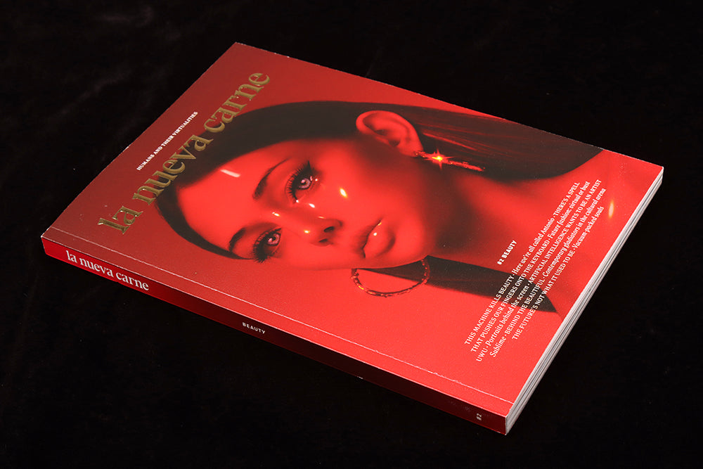
La Nueva Carne #2
Published by a Spanish digital agency, this new magazine addresses the changes the digital realm is imposing on our lives. It’s not the only print magazine we’ve seen recently to address such issues, but is surely the most accomplished.
Its starting point is a fascinating one; the editors have chosen print precisely because of its distance from the digital world they’re usually immersed in. ‘…we publish it on paper, so you can read it in a slow and attentive way, free of clickbait and filter bubble.’
As a package, the magazine is a familiar one at first glance; small-format, perfect-bound and with its logo rendered in all-lower case, it clearly states ‘indie.’ But look closer: that logo is embossed and shiny gold, the cover image a rich red portrait/avatar from the midpoint between photograph and illustration. Not outrightly shocking, yet worryingly weird, it confidently announces the issue theme, Beauty.
Inside, the texts (all in English this time) are well-written and refreshingly accesible; the subjects covered can easily become very technical and specialist but here the angles at which the stories are directed keep the casual reader’s interest. A great example is a piece by Elisa Victoria about authors and their love-hate relationship with the technology they rely on to create their works.

But the best part of the issue is the way the stories are visualised. I hesitate to say illustrated, because while the texts have plenty of space to breath, the accompanying visuals spill over across the pages and do more than back up the words. A concerted effort has been made to focus on the human rather than the digital in all visuals – see Ache Rodriguez’s series of drawings (above) alongside Victoria’s aforementioned essay.
Here are some other examples of the art brings the entire issue to life.
 Nuria Pujol compares the portrayal of people in amazing landscapes on social media to traditional romantic paintings (above) to great effect, emphasising the shared desire for perfection of both forms.
 More explicitly digital references are used by Glasscrayons for a piece looking at how the Like button opened up art appreciation to a coarser discourse. This double page spread is the largest of five artworks accompanying Alejandro Zambudio’s essay.
 As we get used to manipulating images of ourslves online, so we expect to match those images in real life. Patri di Filippo’s essay about shifts in cosmetic surgery trends sees images of the author distorted in multiple ways (above).

A history of the Japanese Kawaii aesthetic – the childishly cute anime/manga/fluffy unicorn mashup led by Hello Kitty – is given a slightly threatening edge in Isra Romero’s art alongside a questionning essay asking whether the phenomenon is as innocent as it seems.
As these examples show, this is a richly visual magazine that uses multiple styles of photography and both digital and analogue illustration to highlight the accessible nature of the writing.
We talk a lot here about magazines establishing a window into their own world, and La Nueva Carne has successfully done just that with this issue. That it has been produced by a digital agency (Barcelona-based Fuego Camina Conmigo) and addresses their own industry critically is even more impressive.
Editor: Samuel Valiente
Art direction: Nuria Pujol


