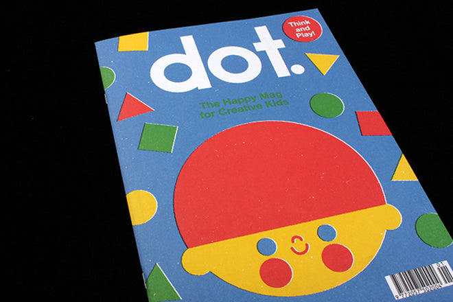
Out now: Dot #1
Anorak Press have just released Dot, a younger version of ‘The Happy Magazine for Kids’ aimed at the under fives. As the editor and founder of Anorak, Cathy Olmedillas, told Jeremy at our Pick Me Up event: ‘A lot of readers have younger siblings, and families have been asking me for years: “When are you going to do an under five magazine?” That’s why I launched Dot. And let’s be honest, I just love launching magazines’.
 The first of Dot’s themes is ‘Shapes’, and the next one will be ‘Colours’. Unlike Anorak, mini, 36-paged Dot is cheaper to put together and therefore doesn’t carry advertising. Also unlike its older incarnation, which has a lot of visual variety, Dot is mostly designed and illustrated by one image-maker, Anorak’s Anna Dunn. The overall feel therefore has a picture-book quality to it, and a cohesive aesthetic of simple primary colours and bold, stencil-like shapes.
 ‘I decided to make Dot because the under five magazine market is very dumbed down. There needs to be design and illustration for the under fives that is a little bit more sophisticated, and which has more respect towards its audience,’ Cathy explained, ‘Dot is high-brow when it comes to design for children.’
 As well as Anna’s work, you’ll also find Andres Lozano’s Mouse Marp comic strip (above), and Jon Boam’s contemporary re-imagining of traditional nursery rhymes (below).

 In the same way that ‘Anorak’ is a character in that magazine, title hero ‘Dot’ is also a character. Dot is not gender-specific: s/he is dressed in a primary coloured oversized t-shirt, allowing the reader to imagine Dot as whatever they want. Children’s magazines are currently marketed and divided into ‘boy’ and ‘girl’ sections on magazine stands, with titles that conform to the idea that ‘blue is for boys’ and ‘pink is for girls’. Dot’s breakdown of commercial norms is therefore progressive and relevant. ‘I was brought up late seventies early eighties, it was all very hippy-dippy. My mum never made me wear pink, I don’t remember Barbie even wearing pink,’ says Cathy, ‘It’s almost like we’ve gone backward rather than forward.’
Like Anorak, Dot uses illustration to stretch the imagination. Cathy’s mission with Anorak Press is clear: ‘I’m not an expert in child education by any means, but I do think that the more varied things you are exposed to, the better the imagination and creativity will become.’


