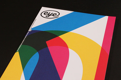
Out now: Eye 83

The latest edition of Eye is out, with a striking close up of one of Massimo Vignelli’s Knoll posters on the front cover.

As well as an extensive Q&A with Vignelli and a peice about the importance of clients by another design hero Ken Garland, the issue has plenty to interest magaholics. Bremen’s Die Zeitschrift der Strasse (above) looks like a great piece of publishing. Similar in distribution to the Big Issue, it’s designed and written by students as part of their degree courses before being distributed on the street.

Adrian Shaugnessy previews his new book about Herb Lubalin, with plenty of editorial work featured including this typographic cover from fact.

Taschen have recently published a book about Neville Brody and Jon Wozencroft’s nineties type publication Fuse, and a look back at the project here features a reproductions of several of the poster artworks created by type designers for the project. Each issue arrived in a smart brown cardbaord box and contained a hard disc with the font files (above) as well as the slightly mad/maddening writings of Wozencroft. Many of the fonts were pure experiment, but some were actually quite usable – I remember using Barry Deck’s Caustic Biomorph font on a Time Out cover.
At £17 Eye is not cheap, as people like to point out, but they’re missing the point. It is more book than magazine, designed and produced with an exacting attention to detail that makes it a vital addition to the design bookshelf in its own right let alone for its content.


