

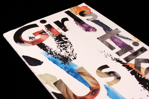
Girls Like Us #6

Now that magazines are getting ever more specific, aimed at particular subcultures or hobbies, sometimes you can forget what it’s like when a publication speaks directly to you. So when Girls Like Us arrived in the post, I had a flutter of excitement that reminded me of the feeling I used to get when I first discovered my favourite music zines as a teenager. Based in the Netherlands, Girls Like Us focuses on women in art, culture and political activism, and its post-gender outlook is accompanied by a design of geometric layers, colourful tints and metallic inks.
Issue six is themed ‘Secrets’, a ponderous theme that considers how knowledge is never neutral, how a secret is ‘the place and moment where knowledge appears and disappears, shows or fades’, as the editor’s note explains. The design is pertinent to this idea, used to reveal or conceal text. A shiny, metallic rust colour runs throughout, providing a cohesive design motif, and the tint glimmers and warps the visibility of the writing. Text appears to vanish when light hits from a certain angle, it ‘shows and fades’ like the editor’s definition of a secret.

The legibility of the text subtly diminishes not just through the shine of the paper, but also through a change in opacity (above). On the contents page, headings seem to disappear and reappear like a hushed whisper.
 Highlighter yellow functions as a spotlight for a section dedicated to Girls Like Us recommendations; it’s brightness is like a torch, and it emphatically reveals best-kept secrets (above). The feature plays on mainstream magazine recommendation sections, and instead of being geared towards selling us products or derivative girliness, this magazine has suggestions from ‘girls like us’ for ‘girls like us’. Friends and heroines contribute to the section: art writer Chris Kraus recommends a plastic jewellery designer to readers, and DJ Anna Frei tells you about a Virginia Woolf inspired record shop.

Like the revealing yellow and concealing rust/gold colours, dashes of light blue in an interview with performance artist Juliana Huxtable hint to the secrets found in the text (above). Reading the interview, it becomes apparent that the blue slashes on the page match Juliana’s staple lipstick colour, an important look for the artist that helped to affirm her sense of sexuality and personal identity.
Elsewhere, the layout of a page is also used to uncover hidden secrets: an interview with art critic Linda Yablonsky has a spread of images that reveal the content of the memory card in her digital camera (below). As the interview delves into the secret life of the notorious Art Forum columnist, so does the accompanying imagery.


The rust colour makes a bold reappearance in a layout for an interview with a researcher based in Chile, who studies rumours and the invisible parts of politics (above). The graphic lines between columns of text makes the page look like its been folded and then unfolded again. The design conveys the sensation of opening something up, which is apt for a piece opening up hidden secrets of politics.

Lastly, a particularly striking layout for a piece on historical women mystics from the 10th Century who have faded into the background sharply repositions them as important by placing their quotes in arresting geometric shapes (above). Here, design is used to emphasise secrets from a past that need to be heard.
Girls Like Us is fresh and dynamic, in parts like an art-centric and graphically jumbled Riposte. It has a headstrong vision like a younger and more experimental incarnation of The Gentlewoman, and has that same fiery perspective that made Frieze so relevant. I find the design discreetly appealing but others might interpret the shiny, slippery text as a flaw.
Like Factory Record’s infamous sandpaper record sleeve for The Durutti Column, which would purposefully erode the records beside it on the shelf, there is something playfully anarchic about the difficulty of reading the rust tinted text of Girls Like Us. Sitting in the sun, the light constantly obscures the magazine’s text, and I have to twist and turn the publication to read the secrets inside.
Review by Madeleine Morley