

Out now: Lobby #2

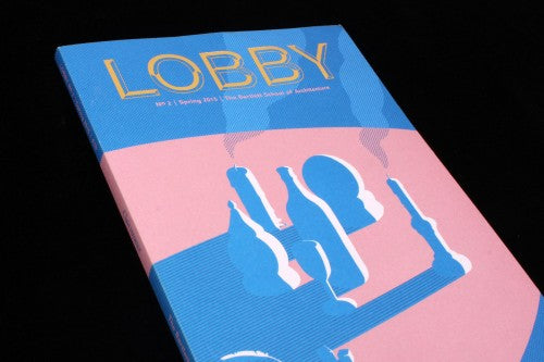
It’s always great when a publication comes through the post with a good belly band wrapped around it, and Lobby from UCL’s Bartlett School of Architecture combines a bold band with a baby pink and deep blue cover – making for an arresting first impression. Its second issue is themed Clairvoyance - and Sara Andreasson’s cover illustration riffs on this idea with building-like formations that are actually candles and a crystal ball.

Aesthetically, Lobby is deliberately clumsy – a difficult look to get right. Occasionally the publication can feel over-crammed with its mismatch of images and colours, but conceptually the idea behind the design is clever. The structure and contents are divided into the rooms of a school (perhaps mirroring the Bartlett) (above), containing everything from ‘The Reception’ (which contains the editor’s letter), to ‘The Seminar Room’, ‘The Lift’, ‘The Library’ and ‘The Toilet’.

Each section is then paired with a different geometric shape and colour (oozing green for ‘The Toilet’, sophisticated gold for ‘The Seminar Room’). Lastly, the geometric shape with designating colour is then printed along the side of the pages, forming strips that look like the dividers in an academic binder (above). By evoking the school’s architecture and the tools of a student in the design, Lobby represents its institution not just in its words but also structurally.

Each section has its own title page, framed by a bright border. These often violently contrast with the previous section’s aesthetic – evoking the spatial sensation of moving from one kind of room into another (above).

Some parts of the magazine – like a blue tint that envelops the entirety of a page (above) and the gold tint of The Seminar Room (below) – are reminiscent to another publication from UCL, our recent Mag of the Week Urban Pamphleteer. From the university’s Urban Laboratory, the publication is also interested in architecture, specifically public space. The aesthetic similarities suggest that there is a design scene developing from within the university, interested in the ways that magazine-making, colour and shape can evoke place and space.

An essay in the ‘Crit Room’ section muses over the connections between clairvoyance and architecture, considering the magic behind conjuring and crafting space. A simple, baby purple complements the photography of precious stones accompanying the piece: here, design, photography and words gel nicely because of their mutual simplicity (above).
A piece on the Tate Modern of the future gazes into London’s architectural crystal ball, and a stand-out piece by FAT Architecture’s Sam Jacob towards the magazine’s end evokes the theme in order to explore the visionary tradition of Britain. While at a first glance, the idea of pairing architecture with clairvoyance seems odd, the content of Lobby finds striking similarities between the two practices. The design of the publication has a clairvoyance of its own, conveying a sense of location and space through a graphic telepathy of shapes and colours.
Editor: Regner Ramos
Art Director: studio 4
Review by Madeleine Morley
Read our review of The Urban Pamphleteer