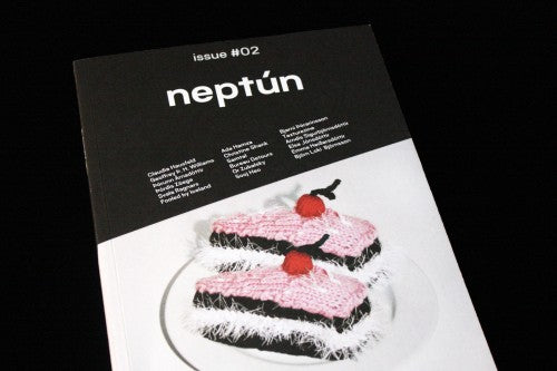
Out now: Neptún #2

There seems to be great talent for magazine making in Iceland at the moment: last week we were impressed by Maena, a publication designed by students at the Icelandic Academy of the Arts, and this week art and design magazine Neptún has caught our attention. Whilst it covers the broad categories of ‘art, design and architecture’, a subtle emphasis on materials creates a unique identity.
The focus on materials is well-suited to the art scene Neptún covers. When we think of Iceland, we think of rocky landscapes, imaginative artistic innovators and warm, woollen sweaters, and the magazine’s special attention to earthy textures and soft fabrics suggests a current art scene that vividly responds to its surroundings and subverts its own stereotypes and traditions. Design-wise, Neptún is a mixture of minimalism and a pleasing messiness; it’s like a stylish bedroom that has socks strewn about it and a purposefully unmade bed.

The overarching aesthetic is a monochrome simplicity, with occasional splashes of red and angled by-lines creating variation and a grungy personality (above). Square images placed within columns of text, a technique reminiscent of the wrap tool on Microsoft Word, is also pleasantly lo-fi.

The portraits of interviewees are taken with bright, unforgiving flash – a technique that especially captures each nook and cranny of the artists’ materials (above). It’s this kind of aesthetic honesty that is at the heart of the magazine. A conversation with musician and artist Or Zubalasky is conducted over email and printed just as it would appear on an email thread (below) – Neptún has a consciously unfussy, casual sensibility.


The rocky textures of Icelandic landscapes are referenced in many of the magazine’s illustrations. Alisa Kalyanova’s artworks accompany a conversation between two artists – textured line drawings that look like they belong on a cover of an Animal Collective album (above). Another highlight is the work of Báru Bjanadóttur and Ionu Sjöfn Huntingdon-Williams; lava-like computer generated images that are both folkloric and digital (below).


A feature on computer desktops is also an original insight into the day-to-day workspace of artists and designers (above). In the same way that a messy but minimal bedroom says a lot about a person, so do desktops, and this feature taps into an overlooked but very telling digital space.
Neptún captures a particular movement; it’s a document referencing a specific time, place and community, and whilst the content might become less relevant when taken out of its context, the magazine still presents international readers with a portrait of an excitingly creative and magical country. The text appears in both English and Icelandic so not to alienate readers from abroad whilst still remaining local, and the design engagingly echoes the artistic scene as well as the geographical one.
Review by Madeleine Morley


