

Out now: Pin-Up #18
Architecture magazines that choose overt design over minimalism set themselves a compelling challenge. They get to think about how to use a flat page to evoke three-dimensional space and atmospheric place; photographs alone can’t quite convey the enveloping sensation of theatrical grandeur or modern strictness that a building might emanate. Pin-Up uses design to joyously converse with the structures and places that it showcases, and it has a particularly fine eye for colour combinations and photographic collages. Now on its its eighteenth issue, the bi-annual has established itself as a serious contender amongst the many other publications of its genre, and it’s unique because of its vibrant energy and tactile sensibility.
 ‘Pin-Up’ as a name is well suited to describing the design: the complex spreads are the kind that architecture lovers would want to rip-out and bluetac above their desks, the overlapping images feeling like mood boards. The magazine opens with the ‘Pin-Up Board’ section, collating design news and recommendations, and emphasising this: photographs and text converge like a scrapbook (above). Changes in background pattern and ink colour (including large swathes of metallic bronze) further exaggerate the fast-pace of the bite size information (below).

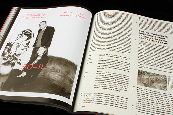
 Interview features and essays are mostly kept within the pallette of brown, white and pink and these elegant spreads are coupled with sophisticated portrait photography (above). The colourful spreads threading between these text-based sections stand out all the more in comparison with the sepia aesthetic. A dreamy building by SO-IL radiates with breezy colours (emphasised even more by a sky blue border, below), and photography by Johann Clausen with Daniel Sannweld is luscious and warm. The boldness of the images, a boldness accentuated by the design, conveys a tangible sense of place.

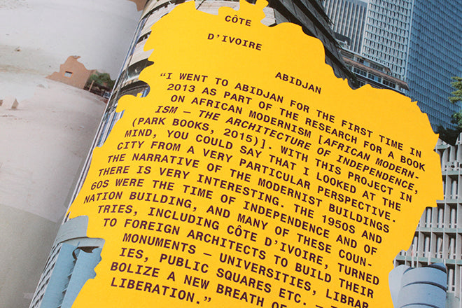
 One of the most courageous design decisions in the whole magazine, and what makes Pin-Up stand out, is the 48-page photographic essay by Iwan Baan. Each issue reserves a chunk of its pages for a project like this one, and if the ‘Pin-Up Board’ was fast-paced, then this section is pleasurably slow. The puzzle-like spreads take readers on a journey from West to East to Southern Africa, with Iwan’s photography documenting mismatching architecture along the way. The section has its own title page (above), and the layout evokes country borders and the splattering amalgamation of styles and regions that the text and picture record (below).

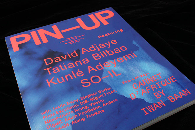
 Look back at previous issues of Pin-Up, and the covers have been slightly timid at times. The last two issues, though, have had arresting covers – atmospheric and transformative, bolder and more potent than those from the past. Harnessing atmosphere is exactly what Pin-Up is best at, a quality that makes the content all the more engaging.