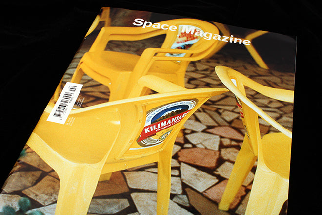
Space #2
There are a lot of lifestyle magazines out there at the moment centred around the notion of ‘place’, magazines showcasing beautifully pristine flats and incredible loft/ barn conversions. It’s great to imagine living in these homes but they are so clean and majestic they’re more like dream-houses than anywhere you would ever actually live: spaces that are somehow immune from the day-to-day reality of leaky sinks, tiny unglamorous bathrooms and noisy neighbours. For its second issue, Space magazine refreshingly taps into a different kind of place-bound fantasy, namely the fantasy of the artist’s studio - the room where the magic happens and where we find treasure-troves of abandoned works-in-progress.
Issue one was themed ‘family and friends’, and editor Frederik Bjerregaard explains the concept at the heart of the issue two in his introduction: ‘Our interest in artists’ studios has been around for as long as we’ve had artists. The space in which great art is created and the daily rituals of the artist fascinate us. The idea that if we see the birthplace of art – the paint-splattered walls and world of the artist – we get closer to its meaning is compelling.’ Space delves into the idea that if we peek up-close at an artist’s routines and habits, we may get closer to unlocking their secrets.


In the workspace of Another Man’s Alister Mackie, photographs of odd trinkets, tulips, velvet fabric and leopard print carpet are a personal insight into the inspiration behind Alister’s aesthetic (above). An inventory at the end of the interview rustles even further into the creative director’s draws and cupboards (also above), and a greying photo of East End rooftops elegantly frames the studio’s view. Space’s method is a familiar and well-trodden ground, yet the concept is executed meticulously well; the magazine is an enjoyably voyeuristic insight into a person’s day-to-day life and creative process. Mamma Anderson’s own Polaroids of her studio in Stockholm are a twist on the conventional way of telling this kind of story; these images are taken from the point of view of the artist so that we see the studio from the eyes of the maker and not the journalist (below).

 Another unconventional take on the idea of the studio is a photo series about chairs by Jonas Unger (above). As the furniture that an artist, designer or writer will probably spend most of their time sat upon, the whimsical chair shoot seems to make a lot of sense. A photography spread of architects and Brutalist buildings in Copenhagen also considers the people who shape space (below).

 The magazine’s layout is simple: double page photographic spreads capture a studio (above), and then inventories dive into small details. The accompanying Q&As are broad in scope, focusing on the overall career of an artist and not just their workplace. The text falls on its own separate, white page (below): images tell one story, and the words another, so design-wise the two are kept emphatically apart.
 Space is a popular topic at the moment; in the online world, space is intangible, so readers are craving a sense of location and it’s becoming more and more of the narrative hook magazines use to tell a story. Places help to define people and Space magazine know and understand this well.


