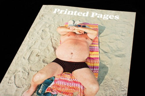
Out now: Printed Pages SS15

Printed Pages is known for its approachable and chatty tone. It’s Nice That, and by implication their magazine, talk about art and design like a bunch of enthusiastic friends sitting around in a pub discussing why they love comics and graphic design so much. This week at Pick Me Up, Jeremy sat down with Printed Pages Editor-in-Chief Rob Alderson as part of the magCulture Live series. What Rob made absolutely clear was the way that the design of the publication has constantly evolved over time, always shifting and re-shaping in order to reflect the very open and approachable tone that It’s Nice That cultivate. ‘The design is a constant process and reiteration,’ Rob explained, ‘There are things we’ve done in the past eight issues that we don’t really like now, and we have learned from them.’ Issue nine has been tweaked and reconceived in order to get closer to visually embodying that sense of celebration, energy and chatty excitement that It’s Nice That exude.
The new issue coincides with the appointment of a new inhouse art director, Jamie McIntyre. ‘He felt some of our previous issues have been a bit stiff, in terms of cover and paper stock,’ Rob told Jeremy, ‘One of his big things was, if we want this to be accessible, we need it to flop open.’ The floppy nature of the new design means that it opens up with ease; it invites you in in a very literal way, not just tonally. Rob spoke about the visceral response that people have to magazines, and how the design of Printed Pages is meant to make people want to smell the pages. As issue nine unfolds, it definitely has that magazine-y whiff of paint shop or newly varnished floor or colourful felt-tip pen. The newfound floppiness of the magazine emphasises the visceral reality of printed matter and the transformative potential of smell and touch.

Another significant change in the design is in the column layout and text size, which in the past took a two-column, small text format. The new issue plays around with font size and the number of columns – using both to focus and clarify the text. For a piece that follows Dan Weiden around the Design Indaba conference, bits of bold jump out from the single column of text like less emphatic pull-quotes (above), guiding our reading experience. A Q&A with NYTimes Magazine design director Gail Bichler – a must-read – uses size to emphasise the typographic change between the two parts of the interview, so the reader visually ‘hears’ the two voices (below). The typographic changes create a chatty atmosphere, and visually bolster the flow of words.


As well as having more variety in font size and type, Printed Pages have also created more of a mixture in terms of article lengths. ‘What we’ve worked very hard to do with this new issue is to look at rhythm a little more,’ Rob explained, ‘We used to have lots and lots of long-form pieces, one after the other, we felt it lacked a bit of finesse. So we have put in short pieces for this issue, ones of around 300/400 words.’ A little opinion piece about how boring watching the creative process can be and a satirical story about attending a private opening are two examples of these new shorter articles (above).


Small inserts also mix up the pace and rhythm of reading: a commission from NB Studio’s Tom Moloney features his collection of fruit wrappers, and is printed on A5 paper that evokes a zine (above). These small sections, both the visual and written ones, break up the longer pieces, providing readers with dippable bits as well as longer essays that require more attention and thought. The small pieces add to the approachability of the publication: you don’t need to sit down for a long read every time you pick up the magazine - you can browse during the day and then read more in depth on a tube journey home.
One of the biggest changes to Printed Pages, though, is the recent announcement that they’ll be going bi-annual. At Pick Me Up, Rob explained the decision very simply and matter-of-factly, ‘We went biannual because we have a small team and we felt that we put out four very good magazines last year, but actually we could put out two excellent magazines this year.’ Port has also recently gone biannual, and it’ll be interesting to see how the new rhythm of deadlines will effect both magazines. As Rob described, a magazine grows by learning from its prior mistakes, and if each issue is so far apart, perhaps mistakes will fade into distant memory. Although both publications will now have a chance to dwell on their content for longer and improve the quality of each issue, one wonders whether bi-annual will eradicate the kind of fast-pace energy that allows a magazine to develop and evolve.
Review by Madeleine Morley


